Custom PLM
User Experiences
Unleash the power of Fusion Manage by utilizing its REST API to provide custom built frontends based on Autodesk Platform Services. All solutions manage data in PLM only. All business rules of PLM as well as access permissions still apply.
This version has been optimized for the tenant template released in 2023 using a single Items workspace. While the solutions can be used with any tenant thanks to their configuration capabilities, using this new tenant reduces configuration efforts. In addition, most of the solutions can be tested with the given demo datasets immediately.
Select Theme:
These solutions are provided by Autodesk Technical Sales without warranty and support. There should be no assumption that updates, patches, bug fixes and / or new features will be delivered to you. There will also be no support available either through Autodesk Support channels or by the Autodesk Pre-sales Technical Team. Please feel free to take the source code and ideas from this tool to develop your own production ready tool and products. Change and reuse the source code as you like.
Reuse this framework and its examples to build your own custom solutions. The Developer Guide provides documentation for key library functionality, the main framework asset and includes tutorials to get started quickly:
Framework Changes
| October 1, 2024 | Framework | Added parameter filters to insertMOW() enabling type and due date filtering |
| September 26, 2024 | New Utility | The new utility User Settings Manager enables definition of standards for new and existing users. This includes setting the theme, sharing workspace views and selection of dashboard charts. See the utility's documentation for additional installation steps required for this utility specifically. |
| September 20, 2024 | New Utility | The new utility PLM Portal provides quick access to PLM data for the shopfloor |
| September 17, 2024 | New Utility | The new utility Workspace Comparison helps keeping workspaces (in different tenants) in sync |
| Framework | Moved files files of Tenant Insights Dashboard to new admin subfolders | |
| 10. September 2024 | Enhancement | When components get hidden in the viewer, advanced controls now enable to unhide selected components or the last one |
| 16. July 2024 | Major Update | The UX server now uses PKCE for authentication instead of the former mechanism involving the Client Secret. This now requries an APS application of type "Desktop, Mobile, Single-Page App" for successful authentication. If not done so yet, create such an app at aps.autodesk.com and provide the given Client ID in file settings.js as in previous releases. The Client Secret now can be omitted. This new app must use the same callback URL as your previous app and end with "/callback" (i.e. http://localhost:8080/callback). If your login to the UX solutions fails with an error code 401, you most likely are still using an APS of another type. Do not forget to run npm install to download the additional module "crypto" if not doney yet after this update. |
| 2. May 2024 | Enhancement | Users can now switch between 3D and 2D viewables within the viewer if given files exist in the item's attachment tab and if this feature has not been disabled for the given user with setting selectFile |
| 29. April 2024 | Enhancement | Paramter path has been added to insertBOM() enabling quick navigation to currently selected component's parent(s). This feature now is available in the apps Design Review and Service Portal. |
| 18. April 2024 | Enhancement | insertAttachments() now can display folders as well, depending on parameter folders (true / false) |
| Enhancement | insertBookmarks() and insertRecentItems() now can display tile images for given records by reetrieving the first image field having a value. | |
| 11. April 2024 | Enhancement | Default theme now can be defined in settings.js. Select from light, dark and black. |
| 15. March 2024 | Framework | Most standard apps now can be extended easier thanks to dedicated css and js files in subfolders custom. Override standard javascript code and css by adding your custom contents to these empty files in /javascripts/custom as well as /stylesheets/custom. For example, if the styling of the MBOM-Editor should be adjusted, add your custom css styling to /public/stylesheets/custom/mbom.css. |
| 29. February 2024 | BOM Displays | New options have been added to collapse the BOM at startup and to prevent expansion of defined items (parameter endItem) |
| BOM Displays | If users do not have access to sub items, the parent item BOM will display a lock icon with tooltip | |
| Attachments | The attachments panels have been reworked and provide new configurable features like version information, various layouts and sizes. See the developer documentation for details. | |
| 15. February 2024 | BOM Displays | New options have been added to the BOM display (counters) and the Flat BOM display (filterEmpty) |
| 10. January 2024 | Theme Support | Use alternate color for this landing page and all the apps by passing the parameter 'theme' when accessing an application. You can choose from the following themes: dark,black and light. The latter one is default if no theme parameter is provided. |
| 13. December 2023 | File Management | To allow further additions, files in folders public and views have been moved to new folders. Some css and js files in folder public got renamed. |
| Settings Files | Alternate settings files enabling to switch between multiple tenants now must be stored in folder settings. These files no longer need the prefix 'settings.' but must keep the suffix '.js'. |
Prerequisites
Your user must have admin privileges to use this dashboard as it uses the system log entries which are hidden for standard users. This privilege will be validated during startup and an error message is shown if permissions are missing. Your user also must have access to the given workspaces that should be taken into account in the insights dashboard.
Please note that the dashboard will retrieve the system log information in small packages. This process takes some time. There is a progress inidicator in top right corner and on top of the header to inform you about the data retrieval progress. You can also review the total number of log entries being processed in tab 'System'.
Configuration Settings
You may want to review the solution's configuration settings in file settings.js to adjust this solution to your needs. This is the default configuration:
'insights' : {maxLogEntries : 500000,maxEventLogEntries : 10000usersExcluded : ['Administrator', 'Import User', 'Job User', 'Integration User']workspacesExcluded : ['Approval Lists', 'Change Approval Templates', 'Checklist Templates', 'Project Templates']}
See a description of these settings below. Note that you have to restart your UX server after changing any of these settings.
| Setting | Default Value | Description |
|---|---|---|
| maxLogEntries | 500000 | This defines the maximum total number of log entries that will be retrieved. If this setting applies to your report, you will find a given remark in tab System. |
| maxEventLogEntries | 10000 | This defines the maximum entries in tab Event Log. This tab will show the most recent entries first. Increasing this value may impact the performance of the dashboard badly as your browser will slow down. Therefore a total maximum of 50.000 entries will never be exceeded, no matter what limit is defined in settings.js By setting this value to 0 you can hide the tab Event Log in the dashboard |
| usersExcluded | ['Administrator', 'Import User', 'Job User', 'Integration User'] | The users defined in this array will be exclueded from the reports |
| workspacesExcluded | ['Change Approval Templates', 'Approval Lists', 'Project Templates'] | The workspaces defined in this array will be exclueded from the reports |
Access the Dashboard
You can access the dashboard with the /insights endpoint, just click this link:
Tenant Insights Change Log
| 17. July 2024 | Enhancement | Last Login chart now can be sorted by 'Username' or 'Days since last login'. In addition, counters to the right indicate the total logins in difined timeframes. These counters also can be clicked to filter the chart. |
| Enhancement | The chart 'Item Count' has been changed from columns to bars. Entries now get sorted by item count to enable better analysis. | |
| Enhancement | Tab 'Event Log' now offers a new filter to display all entries of all users. This filter is selected per default and indicates the maximum number of records being displayed. | |
| Enhancement | The button 'Review Settings' has been added to the header toolbar, enabling to review the configuration settings defined in settings.js (i.e. to review users and workspaces being excluded) | |
| Enhancement | The System tab now indicates the number of entries that have been processed so far. The labels in this tab have been adjusted, for example to reflect the maximum number of records being taken into account. | |
| Enhancement | The new configuration setting 'maxEventLogEntries' can be used to limit the number of Event Log entries being displayed. For performance reasons, a maximum limit of 100.000 gets applied automatically. You can set this limit to 0 also to hide the tab Event Log completely. | |
| Enhancement | The new configuration setting 'workspacesExcluded' can be used to hide defined workspaces from the charts. | |
| Enhancement | A new progress indicator has been added on top of the screen | |
| 12. July 2024 | Enhancement | Added zoom / pan features to the charts, enabling better handling and analysis |
| 18. March 2024 | Enhancement | Improved the scale of the User Activity bubble chart |
| Enhancement | Disabled (startup) animations of charts (except for the charts in the initial tab) | |
| 9. January 2023 | Library Update | The charting library chart.js has been update to most recent version |
| 7. July 2023 | Enhancement | Improved styling with tabs at bottom |
| Enhancement | User's image is shown in top right corner for consistency with other apps | |
| Bugfix | User 'Tenant Admin' now is excluded from reports | |
| New Feature | An error messags is shown if the user does not have admin privileges |
Features
Using the PLM REST API, this utility will analyze the configuration of a selected workspace within two defined tenants. For each difference that is found, the utitlity will provide instructions and shortcuts to perform the given action, for example by using the standard Workspace Manager. This helps to keep business processes in multiple tenants in sync.
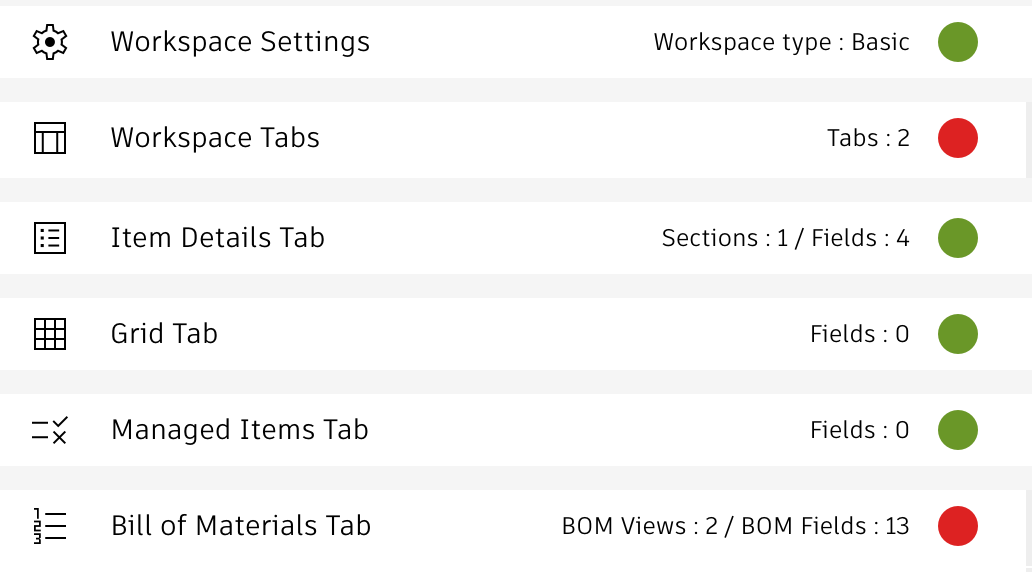
The following information will be compared:
- Workspace Settings
- Workspace Tabs
- Item Details Tab
- Grid Tab
- BOM Tab
- Managed Items Tab
- Picklists
- Relationships
- Advanced Print Views
- On Create & On Edit script
- Workflow States
- Workflow Transitions
- Workflow Scripts
As the REST API does not reveal all details about the workspace configuration, some information cannot be compared automatically (for example the formulas of computed fields). Please see the given details provided within this utility.
Starting The Comparison
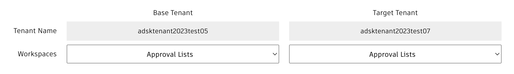
In order to launch the comparison, the names of two tenants must be defined on top. The tenant which the UX Extensions server is connected to will be considered as Base Tenant automatically while the second tenant must be typed in. You can also use the same tenant name for both the Base and Target in order to compare two different workspaces within the same tenant. Once you press enter in teh tenant inputs fields, the given list of Workspaces below will be refreshed.
As the UX server must connect to both tenants, please make sure that your APS Client ID has been whitelisted in both tenants.
If you are going to use this utility often, you can also provide the Target Tenant name as option in the URL. Simpliy append '?options=adsktenant2023test07' to have the given tenant name filled. This will also load the list of workspaces in this tenant automatically.
Finally, select the workspaces to compare. As you select a workspace in the Base Tenant, the utility will automatically select the matching workspaces in the Target Tenant if available. Run the comparison by clicking the blue Start button. Once the comparison is running, you can click the Stop button to end the process.
Reviewing Results
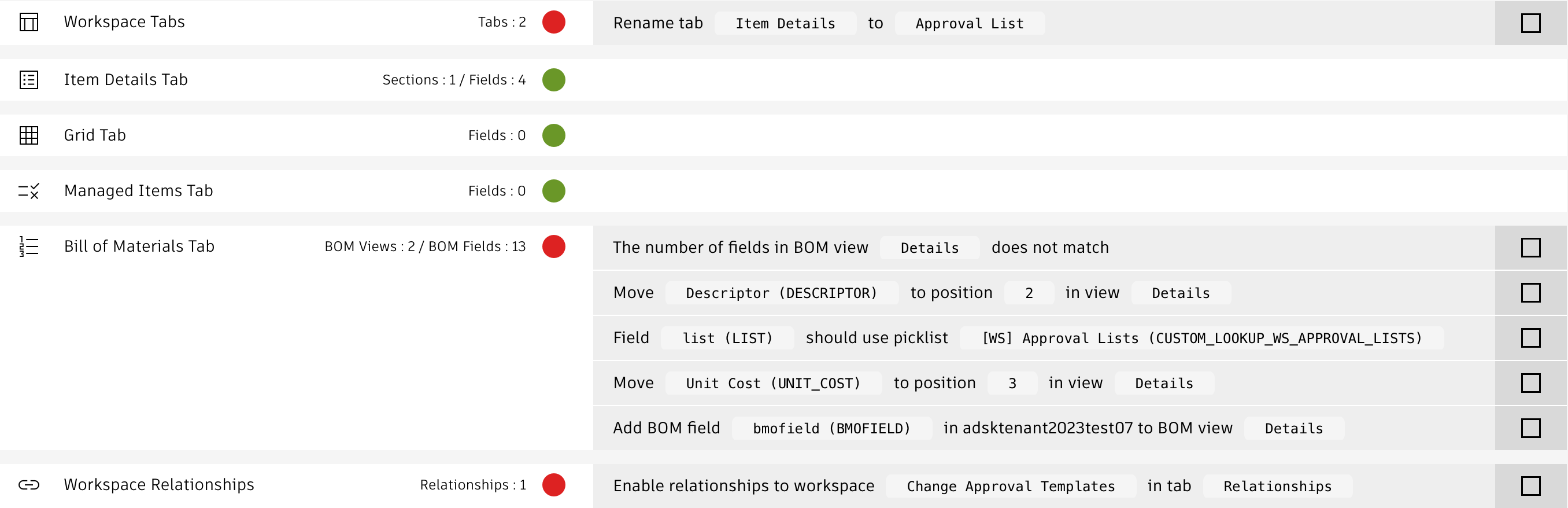
While the comparison is running, summary information will be added to the sections at bottom. These counters relate to the Base Tenant and show the nubmer of field being found for example. The color indicator reveals if the given configuration settings match with the Target Tenant.
Next to these indicators, you will find instructions about how to sync the given workspaces. These instructions refer to the field and setting to be changed and provide the given details. You can click these instructions to open the given administration utility for the Target Tenant. Once the given change has been applied, you can click the checkbox to remind yourself about your progress.
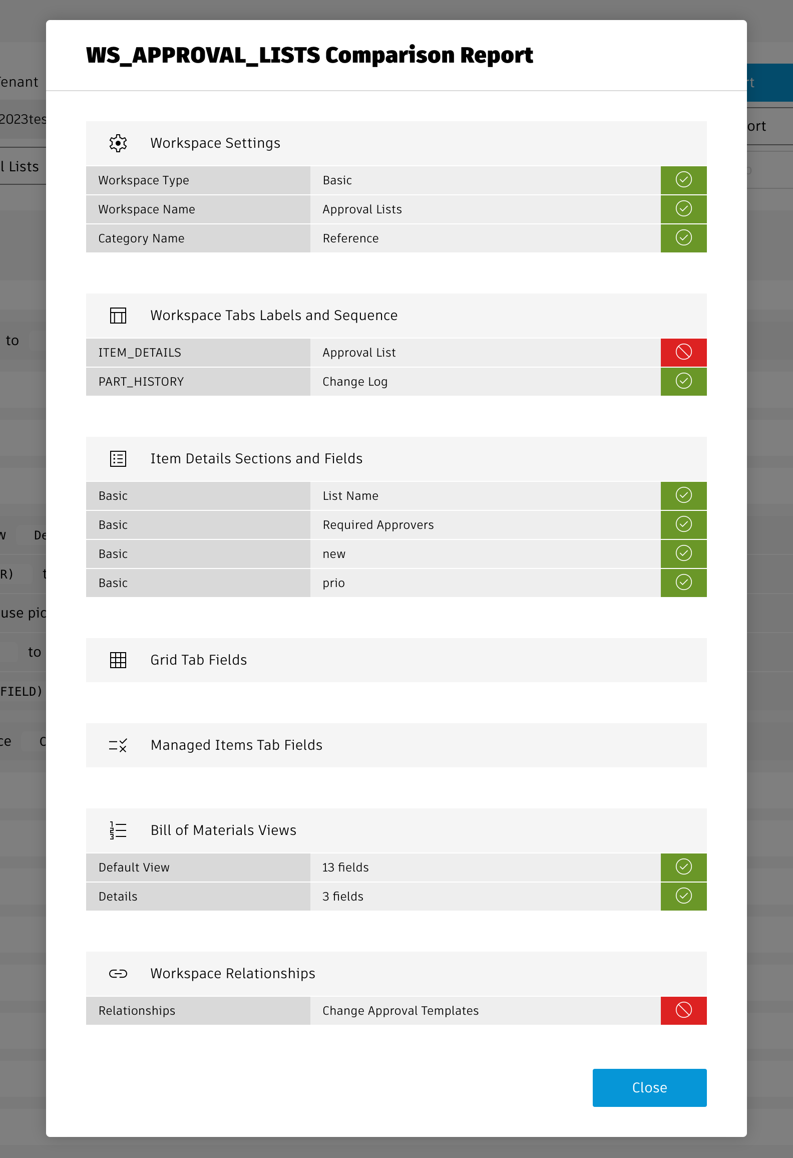
If you prefer a graphic report about matches and differences, click the Report button which gets enabled once the comparison is complete. This report may be helpful to when reviewing the differences.
Tenant Insights Change Log
| September 20, 2024 | Bugfix | Space characters at beginning and the end of section names will be ignored during comparison ('Basic ' now is considered equal to 'Basic' and ' Basic') |
| Bugfix | Fixed the instructions text when default values must be corrected for picklists | |
| Bugfix | Fields of type BOM UOM Pick List threw an error | |
| September 17, 2024 | New | Initial release of this solution |
Important
This utility makes use of impersonation to adjust the views and preferences of other users. This requires a 2-legged-authentication with an APS application based on Client ID and Client Secret. As this weakenes the security, it is recommended to proivde the additional settings required by this utility only if it is going to be used. You may want to use this utility witih a local instance of the UX server only to not have the Client Secret stored on a server being accessible globally.
To enable this utility, you must create an additional APS application of type Traditional Web App, providing a Client ID and a Client Secret. The given Client ID must be whitelisted in your tenant. Next, provide the ID and the Secret in your settings in variables adminClientId and adminClientSecret. Do not change the standard Client ID being used by the other applications.
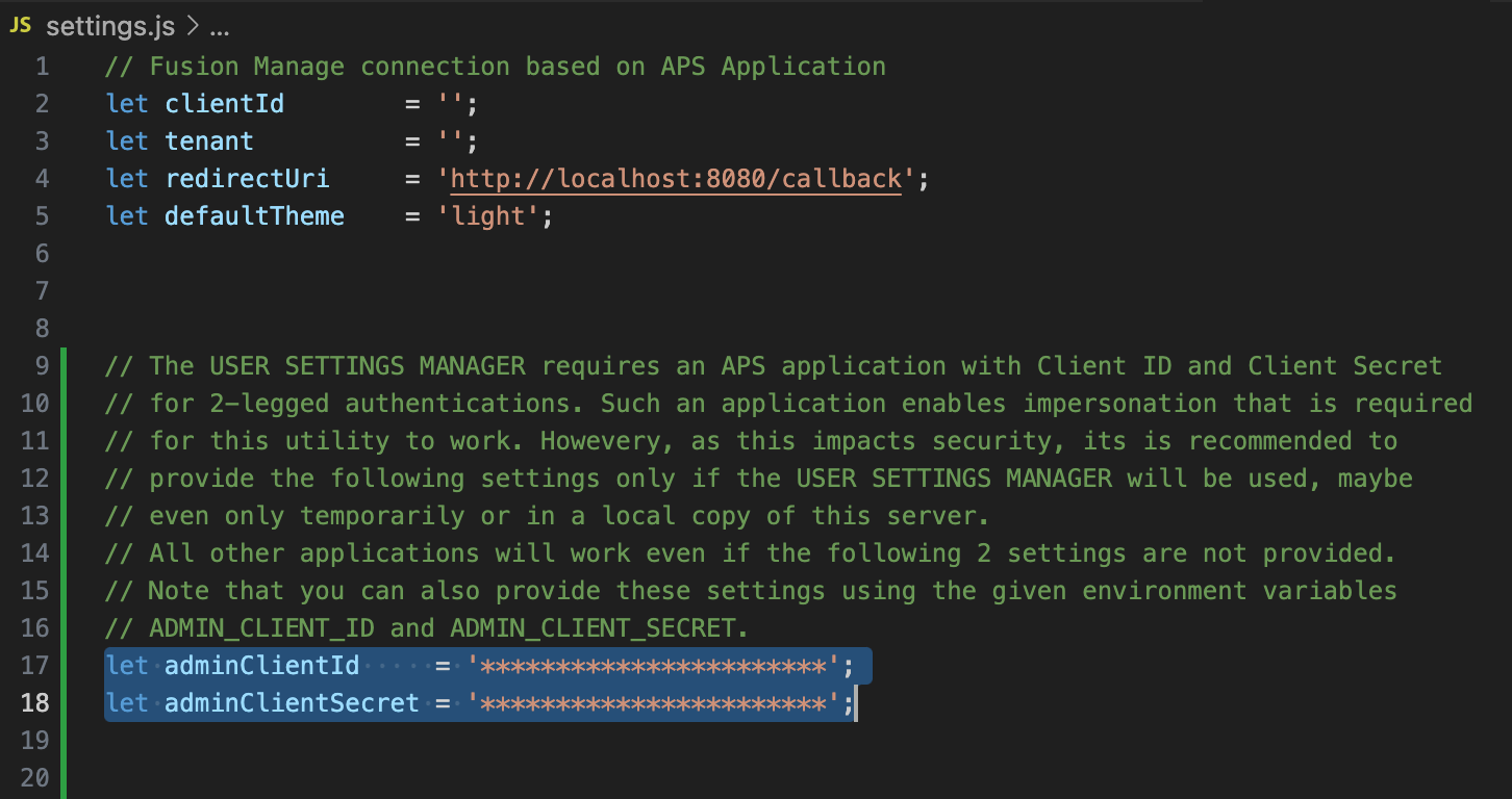
If these two setting are left blank, the UX server will work anyway and you can use all utilities except for the User Settings Manager .
Features
Once you selected groups and users on the left hand side to receive the updated settings, you can use the tabs in center to select the settings to be updated.
Theme
Set the light or dark theme for the user. If you select the option No Change , the given setting will not be changed and the theme selected by the user remains active. Users can still use the standard controls to toggle the theme, this cannot be prevented with this utility.
Workspace Views
Select from your list of workspaces views the ones to be shared with the selected groups and users. Double-click a view to automatically select all views of the same workspace. You can also set one view per workspace as default view using the given toggle next to the view.
If users do not have access to the given workspace, there will be a matching output in the console and the utility will continue processing the remaining views and users.
If a matching view already exists, it will only be updated if you select the Force Update option.
Charts
From the list of charts available to you, select the ones to be shared with the selected groups and users. If a user does not have access to a given chart, the utility will continue with the next chart and user.
If you select to update the user's chart, this will ALWAYS overwrite the current user preferences, the current chart selection will be cleared before the new selection gets applied.
As the user dashboards can only contain a maximum of 9 charts, if you select more than 9 charts, only the first 9 once will be applied. A console output will list the charts being ignored.
Tenant Insights Change Log
| September 26, 2024 | New | Initial release of this utility |
Features
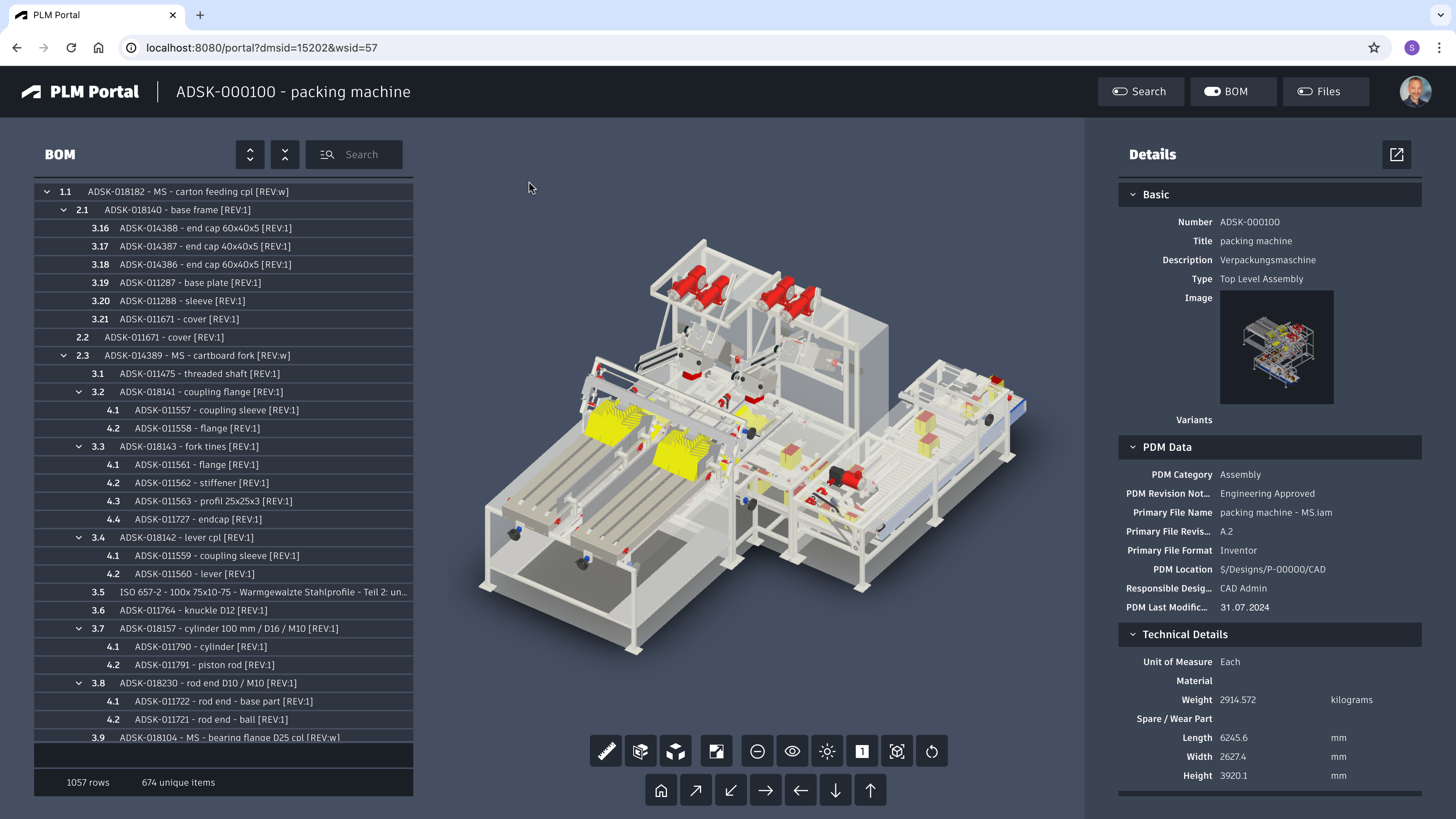
Search for any design using its number and descriptor or access your most recent items to continue where you left. Once a design is selected, the following features are available:
- 3D Viewer with exploded view
- Item Details
- Item Attachments
- BOM with cross-highlight
Define Startup Item
You can pass the parameters dmsId and wsId in your URL to skip the search and let the portal open the given item direclty. Searches are still possible by using the toggle button in the main toolbar.
Configuration Settings
The following settings can be adjusted in your settings file within the portal parameter to adjust the application's behavior:
| Setting | Description | Default Value |
|---|---|---|
| portal.autoClick | When set to true and the search returns one result only, the given item will be selected automaticall | true |
| portal.workspace | Set the workspace being searched for | 57 |
| portal.sectionsExcluded | Provide list of sections (by name) that should be excluded from the Details display | ['AML Summary', 'Quality Inspection', 'Sustainability', 'Compliance', 'Others'] |
| portal.sectionsIncluded | Restrict the Details display to a defined list of sections (defined by name) | [] |
| portal.sectionsOrder | Defines the order of the sections being shown, defined by an array with list of section names | ['Basic', 'Technical Details', 'PDM Data'] |
| portal.fieldsExcluded | Provide list of fields (by field ID) that should be excluded from the Details display | ['ESTIMATED_COST', 'PENDING_PACKAGES'] |
| portal.fieldsIncluded | Restrict the Details display to a defined list of fields (defined by field ID) | [] |
export.config = {'service' : {workspace : 57,autoClick : truesectionsExcluded : ['AML Summary', 'Quality Inspection', 'Sustainability', 'Compliance', 'Others'],sectionsIncluded : [],sectionsOrder : ['Basic', 'Technical Details', 'PDM Data'],fieldsExcluded : ['ESTIMATED_COST', 'PENDING_PACKAGES'],fieldsIncluded : [],viewerFeatures : { .. }}}
Configuring Viewer Features
This application enables configuration of features within the viewer by using parameter viewerFeatures. By using the settings listed below, you can control the availability of given icons in the viewer toolbar. These feaatures can be enabled and disabled for all users in general by setting the value to true or false. As an alternative, you can also provide an array of groups to grant access. Only users being assigned to any of the defined groups will then get access to the feature. Examples:
- viewerFeatures.measure = true > Measurements will be possible for all users
- viewerFeatures.measure = false > Measurements will not be possible for any user
- viewerFeatures.measure = ['Employees','Service Technician'] > The measurements button will only be shown for users in group Employees or Service Technician
| Setting | Icon | Description |
|---|---|---|
| contextMenu | Enables / disables the viewer standard context menu | |
| cube | Enables the cube / home button in top right corner of the viewer. Parameter 'views' can be used instead, providing dedicated buttons. | |
| orbit | Enables the orbit controls | |
| firstPerson | Enables first person view | |
| camera | Enables camera interactions | |
| measure | Enables the measurements toolbar | |
| section | Enables sectioning | |
| explodedView | Enables exploded views | |
| modelBrowser | Enables browsing the model hierarchy within the viewer | |
| properties | Enables access to the selected component's properties stored in the viewable file | |
| settings | Enables viewer settings | |
| fullscreen | Enables fullscreen toggle | |
| markup | Enables markup toolbar | |
| hide | Enables easy hiding of (selected) components | |
| ghosting | Enables toggling ghosting mode on/off | |
| highlight | Enables toggling highlight of selected models on/off | |
| single | Enables fitting of first instance to viewer | |
| fitToView | Enables reframing all visible items | |
| reset | Enables to deselect all, invoking viewerClickReset() | |
| views | Enables toolbar to quickly access main views | |
| selectFile | Enables switching between multiple viewable files for the given item (3D and 2D) |
PLM Portal Change Log
| September 23, 2024 | Enhancement | Added settings 'settionsOrder' that optionally allows for alternate orders of sections in the Item Details display |
| September 20, 2024 | Initial Release | Addition of this utility to the UX Extensions |
Features
- The dashboard makes use of the reports defined in PLM. Make sure that you have valid reports defined in the reports panel.
- The first two out of these reports will get displayed in the dashboard automatically.
- The button Select Reports enables users to select a different set of reports for the dashboard. Note: This given selection will not be saved.
- Users can click on the rows in table based reports to navigate to the given record in PLM.
Limitations
This solution only supports non-stacked column charts and pie charts. All other charts require further developoments.
Configure Startup Reports
The dashboard will automatically load a defined set of reports at startup before users can select their preferred reports using the Select Reports button. These startup reports can be defined in the settings.jsfile.
'reports' : {'startupReportNames' : ['Audits by Workflow State', 'CR approval status', 'DR: Rework Required', 'EX: Change Requests'],'startupReportNames' : 5}
The list of startup repports can be defined by their names using the setting startupReportNames. In addition, startupReportNames can be set to define a minimum number of reports to be loaded if none of the report names match for the current user. In this case, when set to 5, the system will display the first five reports (in alphabetical order) if none of the report names were found.
Reports Dashboard Change Log
| 9. January 2023 | Library Update | The charting library chart.js has been update to most recent version |
| 7. July 2023 | New Feature | Reports can be removed from the dashboard with a new X icon |
| 7. July 2023 | New Feature | Automatic pagination has been enabled for table reports to improve usability |
Features
Access data of relevance easily by having Workspaces Views, your Bookmarks, Recent Items and entries of your My Outstanding Work list combined in a single view. In these views, benefit from various additional features:
- Item style instead of table style
- Filter using type ahead
- Mass Edit Item Details
- Compare and highlight
- Hide / Unhide records in the views
- Perform Workflow Actions on multiple records
- Clone items from the overviews
- Archive multiple records in one action
- Navigate to workspace of interest
- Bookmarks view will be selected automatically if the user bookmarks contain items of the selected workspace
Limitations
You cannot modify fields of type Image and Multiple Picklists in this utility. Also, there are no options when cloning records.
Access the Dashboard
You can access the Workspace Navigator using the /navigator endpoint. You can also access the Workspace Navigator for a defined workspace directly by passing the given Workspace ID wihtin the URL. Changing the workspace then is still possible:
Workspace Navigator Change Log
| 7. July 2023 | Enhancement | Read-only fields are shown as read-only now |
| Enhancement | Button 'Toggle Panel' has been replaced with dedicated close buttons to improve usability |
Prerequisites
This solution does not require any changes to your tenant, all information is retrieved dynamically. However, in order to make the solution accessible on your mobile device, your server must be available from the Internet. For security reasons, it is highly recommended to https connections instead of http.
You can use this mobile client on any mobile platform (Android and Apple) as it does not require installation of an app. Instead, this client is provided as responsive web site that adapts to the screen size automatically.
Features
Users benefit from PLM features on a mobile device:
- Browse Workspaces and given views
- Access Bookmarks and Recently Viewed items
- Create & Search records
- Manage Item Details
- View 3D data
- Upload & download attachments
- Browse the flat BOM of items
- View relationships of a record
- Track related change processes
- Perform Workflow Actions
- Archive & Unarchive items
- Share links to items using mail
- Review the Change Log
The Mobile Client also can be used to navigate to a given record directly. This enables to scan a QR code to be directed to the matching record in PLM. See instructions for accesing the client below for details.
While a lot of features are supported, the client also has limitations. It does not provide access to the following tabs:
- Workflow
- Grid
- Project
Mobile Device Simulation
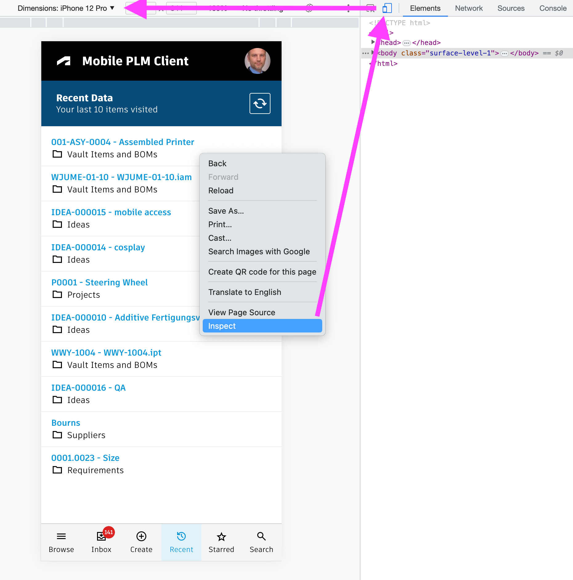
If you want to test this solutions, but cannot access the server online from your phone, your browser can be of help. Open the Mobile Client using the instructions shown below. Once opened, right click the page and select Inspect in Chrome. This will open the developer tools in which you can toggle the device for testing. Just select your preferred mobile device and reload the page. This enables to render the page like on a mobile device.
Access the Mobile Client
You can access the client with the /client endpoint, just click the first button. In order to navigate to a defined record, you can also pass the Workspace ID and DMS ID of a record as parameters. See the second button example which opens a demo dataset item automatically.
Mobile Client Change Log
| 26. October 2023 | Enhancement | Search performance has been improved and styling has been updated for better ease of use |
| 7. July 2023 | - | No changes in this release |
Prerequisites
This app works best with the Items workspace, but can also be used with the former Vault Items and BOMs and Items and BOMs workspaces. However, it is recommended to be used with a workspace where the items have viewable files (dwf) attached.
Features
- Navigate and visualize BOM of a given item
- Browse to item of interest from a landing page
- Filter BOM and 3D view by text and dynamic KPIs
- Apply colours to BOM and viewer to visualise KPIs
- Toggle BOM structure and flat table mode
- Access and download attachments of a selected item
- Review & edit details of selected records
- Review Problem Reports related to a selected item
- Perform markups and initate new Problem Reports for given items
- Manage master data of single records
- Manage master data of multiple records in flat BOM view
Configure Workspace BOM View
This application requires a BOM view that contains all fields required to determine the KPIs for the dashboard shown on the left hand side of the application. It is recommended to create a new BOM view named Details for workspace Items if it does not exist yet - with all the columns shown below. If you omit some of these columns (as they might not exist in your tenant), the given KPIs will be hidden automatically and the dashboard will still work. If you want to reuse an existing BOM view instead, you can change the view's name in file settings.js . Locate the parameter explorer.bomViewName (see given chapter) and change it accordingly (restart the application server afterwards).
List of recommended columns to match the standard KPIs:
- Descriptor
- Number
- Lifecycle (System Field)
- Change Pending
- Type
- Class Name
- PDM Category
- PDM Location
- Responsible Designer
- Material
- REACH
- RoHS
- Spare / Wear Part
- Make or Buy
- Lead Time
- Long Lead Time
- Vendor
- Country
- Has Pending Packages
- Total Cost (BOM Field)
- Total Weight (BOM Field)
Extend Workspace Item Details
If the field DMS_ID does not exist yet in your workspace, add it as Single Line Text (length 20, not visible) in tab Item Details. Let this field be set upon item creation using the following script code:
item.DMS_ID = dmsID;
In addition, add a new computed field Actions to Item Details that renders a button to open the explorer for the current record. Use the formula shown below. In this formula, adjust the workspace ID to match your environment if needed (57 matches the standard Items workspace).
If an Actions field is already present in your Items workspace, add the given formula to your existing Actions field. Note that the latest standard tenant renders multiple buttons in a standard Actions field which are all aligned thanks to a wrapping table. If this table is present in your tenant's Actions field, insert the formula accordingly to the other buttons.
'<a style="border: 1px solid #bec8d2;border-radius:3px;color: #0a131c;font-weight:600;line-height:32px;padding:4px 20px;text-align:center;text-decoration:none !important;white-space:nowrap;" target="_blank" href =" explorer?wsId=57&dmsId='||DMS_ID||'">Explorer</a>'
Make sure that Items can be connected to Problem Reports as affected items. The retrieval of related PRs and also creation of new PRs will fail otherwise.
Configuration Settings
Users can create new Problem Reports for the selected items and also reveal existing processes. As your tenant might be configured differently, you can define the Workspace ID of the matching Problem Reports workspace in your tenant. Open file settings.js and adjust the value of the variable explorer.wsIdProblemReports if needed. This parameter is set to 82 per default to match the default Problem Reports workspace of standard tenants.
Locate the explorer section in file settings.js shown below to adjust your confiugration if needed. These settings are aligned with the latest default tenant as much as possible. After changing this settings file, you have to restart your node server to get them applied.
exports.config = {'explorer' : {'bomViewName' : 'Details','fieldIdPRImage' : 'IMAGE_1','fieldIdPRContext' : 'AFFECTED_ITEM','wsIdItems' : 57,'wsIdProblemReports' : 82,'wsIdSupplierPackages' : 147,'kpis' : [..],'viewerFeatures' : {'cube' : false,'orbit' : false,..} }}
Core Settings
Review the following settings to enable startup of the explorer
| Setting | Description | Default Value |
|---|---|---|
| bomViewName | The Item workspace's BOM view to use for expanding the BOM and getting the KPI values for the dashboard. See instructions above about columns required in this view. | Details |
| fieldIdPRImage | Image field ID of PR workspace that will be used to store the viewer markup screenshot | IMAGE_1 |
| fieldIdPRContext | New PRs can be connected to the currently selected item with this property. Provide a field ID of a linking pick list that allows to select items. The given input in the create dialog then will automatically be set to the current item. | AFFECTED_ITEM |
| wsIdItems | The Item workspace ID. This parameter is required for loading the landing page. | 57 |
| wsIdProblemReports | The Problem Report workspace ID. This parameter is required for creation of new PRs. | 82 |
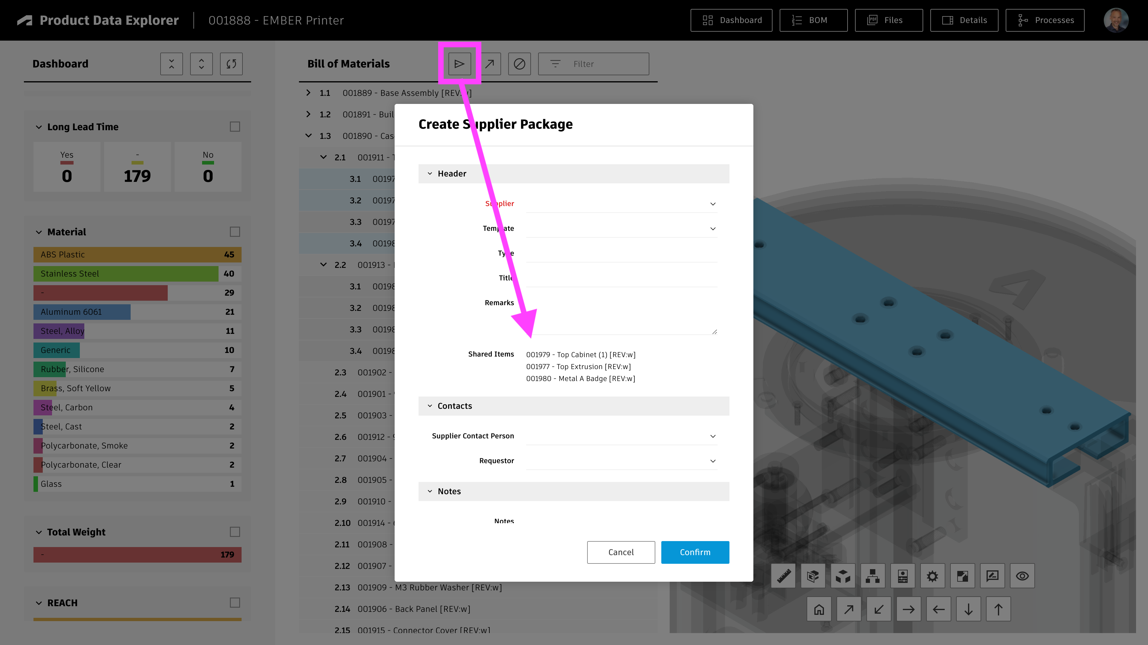
| wsIdSupplierPackages | The Supplier Packages workspace ID. This optional parameter is required for sending selected data to suppliers using the given workspace (see the following screenshot). | 147 |
This explorer also can be used to identify items to be shared with suppliers (i.e. new or changed components). Therefore, one can provide the Workspace ID of Supplier Packages in setting wsIdSupplierPackages . If this setting is provided, users can click the given icon to create a new package for selected BOM components easily
Configuring the Dashsboard
The 'kpis' parameter of config.explorer defines the KPIs being displayed in the explorer's dashboard to the left. You may change them, but please create a backup copy of the original settings.js file before. Keep in mind that all KPIs require you to include the given data as column to the BOM view (which is defined by explorer.bomViewName). If you want to visualise the value of field Material for example, this field must be included in the new BOM view as well.
Certain KPIs are preconfigured to match the standard Items workspace. For example, the dasboard will display counters to reveal items undergoing a change, and also display bars to indicate the PDM category:
{'id' : 'change','title' : 'Pending Change','fieldId' : 'WORKING_CHANGE_ORDER','urn' : '','type' : 'non-empty','style' : 'counters','data' : [{ 'value' : 'Yes', 'count' : 0, 'color' : colors.list[0], 'vector' : vectors.red },{ 'value' : 'No' , 'count' : 0, 'color' : colors.list[4], 'vector' : vectors.green } ]},{'id' : 'pdm-category','title' : 'PDM Category','fieldId' : 'PDM_CATEGORY','urn' : '','type' : 'value','style' : 'bars','data' : []}
Each KPI is configured with the same parameters:
| id | Unique identifier for each KPI |
| title | The title being displayed for the given KPI in the dashboard |
| fieldId | ID of the given item details field to retrieve the given value - or the id of the given BOM column |
| urn | Is set during runtime, leave it blank |
| type | Defines if the KPI should be based on the given value (value) or if it should just indiate if the given field is not empty (non-empty) |
| style | Select if the KPI should be presented as counters or colored bars with value. No matter which style you choose, users will be able to filter using the given KPI anyway. |
| data | Leave this array blank for a dynamic range of values. If you want to predefine the range of interest and given colors, define the given datapoints in this array as shown for the Pending Changes. |
Configuring Viewer Features
This application enables configuration of features within the viewer by using parameter viewerFeatures. By using the settings listed below, you can control the availability of given icons in the viewer toolbar. These feaatures can be enabled and disabled for all users in general by setting the value to true or false. As an alternative, you can also provide an array of groups to grant access. Only users being assigned to any of the defined groups will then get access to the feature. Examples:
- viewerFeatures.measure = true > Measurements will be possible for all users
- viewerFeatures.measure = false > Measurements will not be possible for any user
- viewerFeatures.measure = ['Employees','Service Technician'] > The measurements button will only be shown for users in group Employees or Service Technician
| Setting | Icon | Description |
|---|---|---|
| contextMenu | Enables / disables the viewer standard context menu | |
| cube | Enables the cube / home button in top right corner of the viewer. Parameter 'views' can be used instead, providing dedicated buttons. | |
| orbit | Enables the orbit controls | |
| firstPerson | Enables first person view | |
| camera | Enables camera interactions | |
| measure | Enables the measurements toolbar | |
| section | Enables sectioning | |
| explodedView | Enables exploded views | |
| modelBrowser | Enables browsing the model hierarchy within the viewer | |
| properties | Enables access to the selected component's properties stored in the viewable file | |
| settings | Enables viewer settings | |
| fullscreen | Enables fullscreen toggle | |
| markup | Enables markup toolbar | |
| hide | Enables easy hiding of (selected) components | |
| ghosting | Enables toggling ghosting mode on/off | |
| highlight | Enables toggling highlight of selected models on/off | |
| single | Enables fitting of first instance to viewer | |
| fitToView | Enables reframing all visible items | |
| reset | Enables to deselect all, invoking viewerClickReset() | |
| views | Enables toolbar to quickly access main views | |
| selectFile | Enables switching between multiple viewable files for the given item (3D and 2D) |
Access the Explorer
If your tenant contains the default demo datasets and once you have the BOM view configured as described above, you can open the explorer using the link below:
You can also open the explorer's landing page by omitting the dmsId parameter:
Product Data Explorer Change Log
| 26. April 2024 | Enhancement | Added setting viewer.hide to support easy hiding of components in viewer |
| 22. April 2024 | Enhancement | Added a search panel to the new landing page, enabling users to quickly access any item |
| 18. April 2024 | Enhancement | The explorer now can be opened without providing a dmsId. In this case, the explorer will display a landing page where users can navigate to the item of interest using recently viewed items, bookmarked items and workspace views. If a dmsId is provided, users can click the Home button to access this landing page in order to switch to another design. |
| Enhancement | Viewer features now can be configured in settings.js, enabling to hide / show toolbar icons of interest. Documentation has been extended accordingly. | |
| Enhancement | Landing page now display images for recent and bookmark items | |
| 12. April 2024 | Enhancement | The Affected Items field of new Problem Reports will link the currently selected item automatically. |
| 28. November 2023 | Enhancement | Added RoHS to standard KPI configuration |
| 15. September 2023 | Enhancement | Added further KPIs to standard configuration |
| 3. August 2023 | Bugfix | Improved behavior of markup toolbar at lower resolutions |
| Bugfix | Width of markups and font size of markup text can now be set properly | |
| 7. July 2023 | New Feature | When switching to the flat BOM view, users can modify properties for multiple records (given the fields in the defined BOM are editable) |
| Enhancement | Enhanced KPI definition to match standard properties and BOM view of new default tenant |
Features
Users can track progression of processes, update existing processes and create new processes with ease using this dashboard. The dashboard provides access to a single workspace only to reduce complexity.
- Create new processes by providing basic data only (only if create permission is granted)
- Review history of selected processes
- Update status of a given process
- Download and upload process attachments
- Use 3D markups to document process
- Access bookmarked and recent processes
- Track proces progression in Kanban
- Review process updates in a chart
- Access defined dashboard directly (by providing valid wsId as parameter) or select from configured profiles
Configuration Settings
This dashboard can be used with any workspace but requires the matching configuration in file settings.js. This application is preconfigured for the workspaces Problem Reports , Change Requests and Project Tasks of default tenants. Additional workspace configuration profiles can be added by copying one of the existing configurations shown below.
'dashboard' : [{'title' : 'Problem Reporting Dashboard','wsId' : 82,'icon' : 'account_tree', // Use https://fonts.google.com/icons to search for icons'fieldIdSubtitle' : 'DESCRIPTION','fieldIdItem' : 'AFFECTED_ITEM','imageFieldsPrefix' : 'IMAGE_','workflowHistory' : {'showNextActions' : true,'excludedTransitions' : ['Close Report'],'finalStates' : ['Completed'] },'progress' : [{ 'label' : 'New', 'color' : colors.red, 'states' : ['Create'] },{ 'label' : 'Analysis', 'color' : colors.yellow, 'states' : ['Review', 'Technical Analysis'] },{ 'label' : 'Improvement', 'color' : colors.yellow, 'states' : ['CAPA in progress', 'Change Request in progress'] },{ 'label' : 'Completed', 'color' : colors.green, 'states' : ['Completed'] }]},{'title' : 'Change Requests Management','wsId' : 83,'icon' : 'rebase_edit','progress' : [{ 'label' : 'Planning', 'color' : '#000000', 'states' : ['Create'] },{ 'label' : 'Review', 'color' : colors.red, 'states' : ['Review & Impact Analysis', 'Peform Tasks', 'Change Control Board Review'] },{ 'label' : 'In Work', 'color' : colors.yellow, 'states' : ['Change Order in progress'] },{ 'label' : 'Completed', 'color' : colors.green, 'states' : ['Completed'] }]},{'title' : 'Project Actitivity Management','wsId' : 90,'icon' : 'account_tree','progress' : [{ 'label' : 'Planning', 'color' : colors.red, 'states' : ['Planning'] },{ 'label' : 'Assigned', 'color' : colors.red, 'states' : ['Assigned'] },{ 'label' : 'In Work', 'color' : colors.yellow, 'states' : ['In Work'] },{ 'label' : 'Review', 'color' : colors.green, 'states' : ['Review'] },{ 'label' : 'Completed', 'color' : colors.green, 'states' : ['Completed'] }]}]
Each profile requires the settings listed below.
| Setting | Example Value | Description |
|---|---|---|
| title | Problem Reporting Dashboard | Sets the application title shown in the main toolbar and tab name |
| wsId | 82 | ID of PLM workspace to use for the dashboard |
| icon | account_tree | Google font icon to use for the business process type (Use https://fonts.google.com/icons to search for icons) |
| fieldIdSubtitle | DESCRIPTION | Use this setting to select the field which will be used as subtitle for the tiles of business processes |
| fieldIdItem | AFFECTED_ITEM | Provide ID of the field that is used to connect the business process to a context item. If this optional field is defined and has a value, the given item's viewable will be shown to the right. |
| imageFieldsPrefix | IMAGE_ | Provide the prefix of Image fields to be used to store markups. If this setting is omitted, the markup feature will not be enabled when opening a selected process. |
| progress | [..] | Maps the business process workflow states to a linear sequene of steps to provide a better overview of the process progression. Each entry of this array must contain a label that will be used in the applcation, a color code to use for this state as well as the list of workflow 'states' that match to this step. |
| workflowHistory | {..} | These optional parameters can be used to suppress the workflow history display. It also enables to hide certain transitions and to define the final states (which will be shown with a different icon). |
Access the Dashboard
You can access the process dashboard with the /dashboard endpoint by providing the workspace profile to use. The value of parameter wsId has to match the wsId property value of the configuration profile to use. If you're connected to a default tenant of 2023 or later, you can use these links:
You can also omit the workspaceId and select from the list of configured profiles instead:
Process Dashboard ProfilesProcess Dashboard Change Log
| 8. March 2024 | Extension | Users now can access a landing page with all available dashboard configurations by omitting the wsId parameter |
| 6. March 2024 | Extension | The dashboard now validates the user's access permissions and only shows the create panel if the 'Add Items' permission is granted to the user in PLM |
| Extension | Added a new configuration profile in settings.js to support the 'Supplier Deliverables' workspace of the 2023 default tenants | |
| 16. November 2023 | Extension | Added configuration profile for management of Non Conformances (incl. given button in documentation) |
| 6. October 2023 | Release | Initial release of this new app |
Prerequisites
Your tenant must have the Product Portfolio Management app installed (providing the workspaces Product Categories, Product Lines and Products). If your tenant has been created after April 2021, changes are high that it meets this requirement.
Features
Users can navigate the various level of the portfolio from Product Categories down to Products in an easy manner. Once a product is selected, users can retrieve a couple of information:
- The Marketing Text managed in section 'Product Catalog Definition' can be used to describe the product's features
- The images managed in section 'Product Catalog Images' can be opened
- If Classification section is added to the Products workspace, the given technical specification can be seen
- The product attachments can be downloaded
- If an engineering BOM item is linked to the product, the given BOM can be accessed and the given root item's viewable will be rendered
Adjust Workspace Products
If your tenant has been created in 2023 or later, the Products workspace should meet the following requirements already, so the following changes might not be required!
Add the Classification section to the Products workspace. This enables the management of technical specification based on the product type. The given information will be displayed in the catalog as well.
Set the field Engineering BOM to be a pick list, enabling references to the workspace Items (if existent, otherwise use Vault Items and BOMs). When using the app, only if an item is selected in this field, the product catalog will be able to render the 3D design of the product (as this will render the related item's dwf). Also, this given item will be used to retrieve the product Bill of Materials.
Configuration Settings
A couple of settings can be adjusted in file settings.js to match your environment if needed:
export.config = {'portfolio' : {'bomViewName' : 'Basic','hierarchy' : ['Product Categories', 'Product Lines', 'Products']}}
- In setting bomViewName, provide the name of a BOM view of your items workspace which contains the Number field as column. If this column is missing, the highlighting of BOM items in the viewer will fail. Make sure that this number's Field ID is also properly defined in viewer.fieldIdPartNumber within the settings file.
- If you renamed the standard workspaces of Product Portfolio Management, you can provide the new names in parameter hierarchy.
Product Portfolio Catalog Change Log
| 26. September 2023 | Enhancement | Once a product got selected, a new button in the toolbar enables to open the related Services Portal for this product |
| 7. July 2023 | Enhancement | Better demo datasets in the default tenant to match this app (i.e. Marketing Names and Marketing Texts on Product Lines and Product Categories) |
Prerequisites
Your tenant must have the latest NPI solution installed (providing the workspaces Projects, Project Tasks, Teams and so on).
Features
The dashboard will provide insights in all projects that are accessible to the current user and display the following reports:
- The timeline of each projects by showing all Gates' target dates
- The Status Reports of each projects
- Current progress, project budget and progress of current phase of each project
- The planned effort for each project's phase
- Deviations of project end dates
Configuration Settings
Provide the ID of your Projects workspace in file settings.js. Adjust the value of the following variable which is set to 86 to match the default Projects workspace.
export.config = {'projects' : {'wsIdProjects' : '86',}}
Projects Dashboard Change Log
| 21. November 2023 | Enhancement | Add configuration setting config.projects.query to settings file, enabling to filter of projects |
| 7. July 2023 | - | No changes in this release |
Prerequisites
You must have the latest Design Review app installed from the App Store. If your tenant is based on a template past April 2021, this given app is included already. To check if your tenant contains this latest app, please verify that the workspace Design Review Tasks is available in your tenant.
Configure Workspace Design Reviews
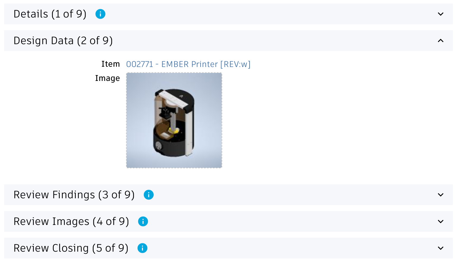
Use the Workspace Manager to perform the following changes to your workspace Design Reviews:
- Add section Design Data if it does not exist
- Add the field Item (id ITEM) to it if it does not exist yet. Make this a single selection picklist field referring to workspace Items (or Vault Items and BOMs if Items does not exist)
- Also, add the field Image (id IMAGE) as derived field of the previous field and let it derive the image field
Configure Workspace Design Review Tasks
Use the Workspace Manager to perform the following changes to your workspace Design Review Tasks:
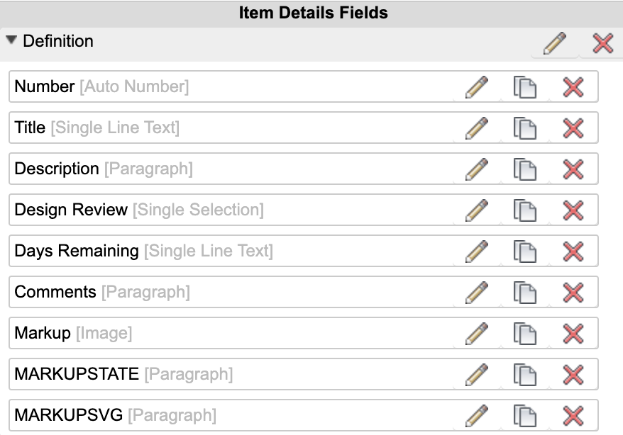
- Add an image field MARKUP to the first section
- Add two fields of type paragraph: MARKUPSTATE and MARKUPSVG. Set maximum length to 1.000.000 for both fields and set their visibility to Never. Set them to be editable anyway. Add these two fields to the first section of Item Details.
- The following fields must be editable at creation:
- TITLE
- DESCRIPTION
- DESIGN_REVIEW
- TARGET_COMPLETION_DATE
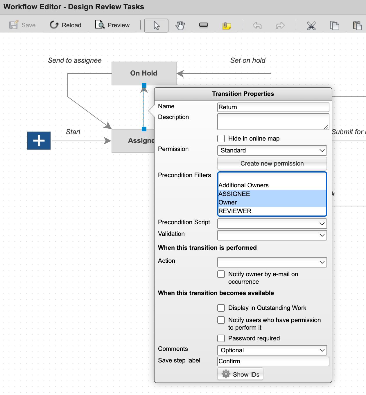
- Field ASSIGNEE must NOT be mandatory
- Disable Workflow Locking for all sections
- Enable transition Return also for the Owner. If this permission is not granted, the creation of tasks will fail as the given user cannot upload the markup image after task creation.
Grant permission to Add Items in workspace Design Review Tasks for all the users which will use the Design Review Portal.
Script Changes
Let new Design Review Tasks be connected to the related Design Review by adding the following script to the initial workflow transition (from the Start Node) in workspaces Design Review Tasks:
if(item.DESIGN_REVIEW !== null) { item.DESIGN_REVIEW.project.addTask(item); }
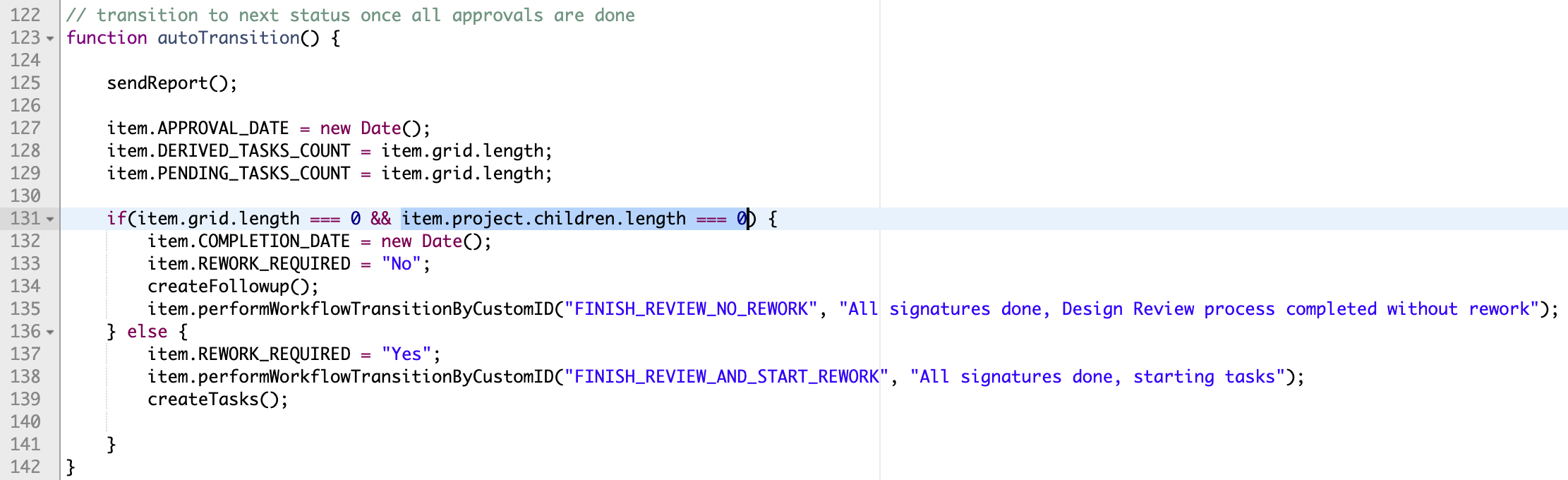
Adjust the script Design Reviews WF Actions by extending the if statement with the following condition as shown in the screenshot below:
item.project.children.length === 0
BOM View configuration for Items workspace
This solution requires a BOM view in the Items workspace which includes the Number field. Only if this column is present, the cross-highlight between the BOM and the viewer will work. The latest tenant template includes such a view Basic already and this solution will use this view automatically. Perform the following steps if this standard Basic view does not exist in your tenant. If it exists, make sure that the basic columns required are included in this view:
- Descriptor
- Quantity
- Number
Use the Workspace Manager to add a new view in the Bill of Materials Tab with the columns shown in the screenshot below. Note that for performance reasons, it is recommended to use a BOM view with the bare minimum of fields only. Anyway, you can add further fields to this view or reuse another view which includes these fields already to not mess up your BOM views.

If your BOM view of choice is not named Basic, you will have to provide this view's name in file settings.js using parameter bomViewName. See the next chapter for details. Keep in mind that you have restart your server to apply the changes to settings.js.
Configuration Settings
Locate the reviews section in file settings.js shown below to adjust your confiugration if needed. These settings are aligned with the latest default tenant as much as possible. After changing this settings file, you have to restart your node server to get them applied.
export.config = {'reviews' : {'fieldIdItem' : 'ITEM','fieldIdImage' : 'IMAGE','fieldIdMarkup' : 'MARKUP','transitionId' : 'CLOSE_REVIEW','bomViewName' : 'Basic','viewerFeatures' : {'cube' : false,'orbit' : false,..},'workspaces' : {'reviews' : {'id' : 76,'sections' : [ { 'name' : 'Review Findings' } ],'states' : [ 'Planning', 'Preparation', 'In Progress' ]},'tasks' : {'id' : '','sections' : [ { 'name' : 'Definition' }, { 'name' : 'Schedule' } ],'states' : [ 'Assigned', 'On Hold', 'In Work', 'Review', 'Complete' ]}},}}
| Setting | Description | Default Value |
|---|---|---|
| fieldIdItem | Defines the Design Review's fieldID used to link the Item to be reviewed | ITEM |
| fieldIdImage | Defines the Design Review's fieldID used to store the linkede Item's preview image | IMAGE |
| fieldIdMarkup | FieldID of Design Review Task to use for storing the Markup image | MARKUP |
| transitionId | Defines the workflow action ID that can be used to close / finish a given design review. If the user has permission to perform this defined transition, the given button Finish will be displayed when opening a design review. | CLOSE_REVIEW |
| bomViewName | The Item workspace's BOM view to use for expanding the BOM. See instructions above about minimum columns required in this view. | Basic |
| workspaces | The workspaces parameter enables to align this solution with your workspace configuation:
| |
Configuring Viewer Features
This application enables configuration of features within the viewer by using parameter viewerFeatures. By using the settings listed below, you can control the availability of given icons in the viewer toolbar. These feaatures can be enabled and disabled for all users in general by setting the value to true or false. As an alternative, you can also provide an array of groups to grant access. Only users being assigned to any of the defined groups will then get access to the feature. Examples:
- viewerFeatures.measure = true > Measurements will be possible for all users
- viewerFeatures.measure = false > Measurements will not be possible for any user
- viewerFeatures.measure = ['Employees','Service Technician'] > The measurements button will only be shown for users in group Employees or Service Technician
| Setting | Icon | Description |
|---|---|---|
| contextMenu | Enables / disables the viewer standard context menu | |
| cube | Enables the cube / home button in top right corner of the viewer. Parameter 'views' can be used instead, providing dedicated buttons. | |
| orbit | Enables the orbit controls | |
| firstPerson | Enables first person view | |
| camera | Enables camera interactions | |
| measure | Enables the measurements toolbar | |
| section | Enables sectioning | |
| explodedView | Enables exploded views | |
| modelBrowser | Enables browsing the model hierarchy within the viewer | |
| properties | Enables access to the selected component's properties stored in the viewable file | |
| settings | Enables viewer settings | |
| fullscreen | Enables fullscreen toggle | |
| markup | Enables markup toolbar | |
| hide | Enables easy hiding of (selected) components | |
| ghosting | Enables toggling ghosting mode on/off | |
| highlight | Enables toggling highlight of selected models on/off | |
| single | Enables fitting of first instance to viewer | |
| fitToView | Enables reframing all visible items | |
| reset | Enables to deselect all, invoking viewerClickReset() | |
| views | Enables toolbar to quickly access main views | |
| selectFile | Enables switching between multiple viewable files for the given item (3D and 2D) |
Design Reviews Change Log
| 26. April 2024 | Enhancement | Added setting viewer.hide to support easy hiding of components in viewer |
| 18. April 2024 | Enhancement | Replaced Flat BOM display with BOM Tree display (offering search capabilities, position numbers and quantitiy information) |
| Enhancement | Viewer features now can be configured in settings.js, enabling to hide / show toolbar icons of interest. Documentation has been extended accordingly. | |
| Enhancement | Latest viewer enhancements get enabled per default: Fokus on single instance, toggle component highlight and more | |
| Documentation | Added instructions for BOM view configuration which is required for proper component highlight in viewer | |
| Quality | Some styling issues got fixed | |
| 30. August 2023 | CONFIG CHANGE | Formerly, the field IMAGE_1 was used to store the markups of Design Review Tasks. This has been changed and field MARKUP will be used instead now. Please review the installation instructions once again and compare it with your setup. |
| Documentation | Adjusted installation instructions to ease deployment | |
| 3. August 2023 | Bugfix | Improved behavior of markup toolbar at lower resolutions |
| Bugfix | Width of markups and font size of markup text can now be set properly | |
| 7. July 2023 | Enhancement | Better alignment of installation instructions with new default tenant |
Troubleshooting
Missing coordinator in demo data sets
Features
Provide an online interface for service technicians to have latest product information at hand at anytime, anywhere.
- View the 3D design in context of the BOM
- Browse and filter the product BOM
- Select BOM items to retrieve all details
- Download item documentation
- Access list of defined Spare Parts
- Submit Spare Part Requests
- Capture Problem Reports
- Browse catalog of serviceable products
- Track progression of and update formerly create spare part requests
Prerequisites
- This solution is based on the standard Items workspace and its standard properties.
- Spare parts get identified by the standard field Spare Wear Part of workspace Items. If this property's value is set to Spare Part or Wear Part for an item, it will be treated as spare part in this portal.
- In order to create and manage the Spare Part Requests processes, you have to add the given workspace to your tenant as described below.
Limitations
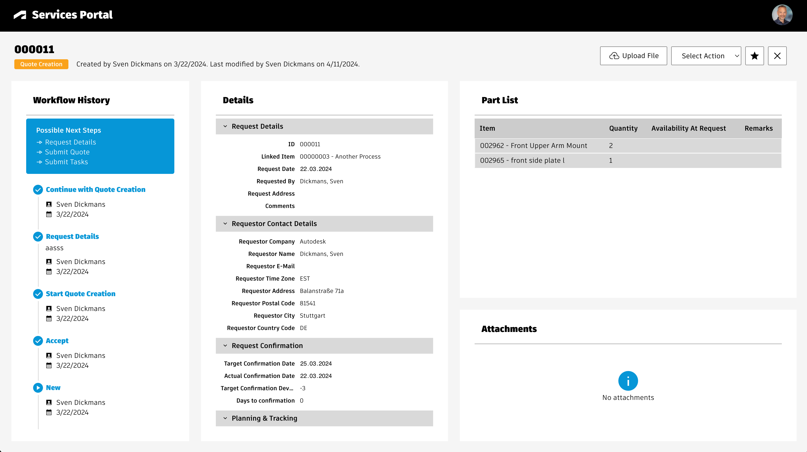
Note that there is no capability to track the progress of Spare Part Requests in this application. The given button Pending Requests has no function. Tracking of requests in only possible in the standard user interface of PLM for now. This might change in future releases of this application.
The application indicates the stock availability of each spare part using colors. As this solution does not have a real time connection to an ERP, the given information is generated randomly.
Create BOM View 'Service' for workspace Items
Create a new BOM view Service for workspace Items and add at least the columns shown below. The sequence of columns does not matter. You may add further fields if needed, but this may impact performance / load times of the portal.
| Source | Source Field | Display Name |
|---|---|---|
| System | Descriptor | Descriptor |
| Item Details / Basic | Image | Image |
| Item Details / Basic | Number | Number |
| Item Details / Basic | Title | Title |
| Item Details / Technical Details | Dimensions (LxWxH) | Dimensions (LxWxH) |
| Item Details / Technical Details | Material | Material |
| Item Details / Technical Details | Spare / Wear Part | Spare / Wear Part |
| Item Details / Technical Details | Weight [grams] | Weight [grams] |
| BOM Fields | Quantity | Quantity |
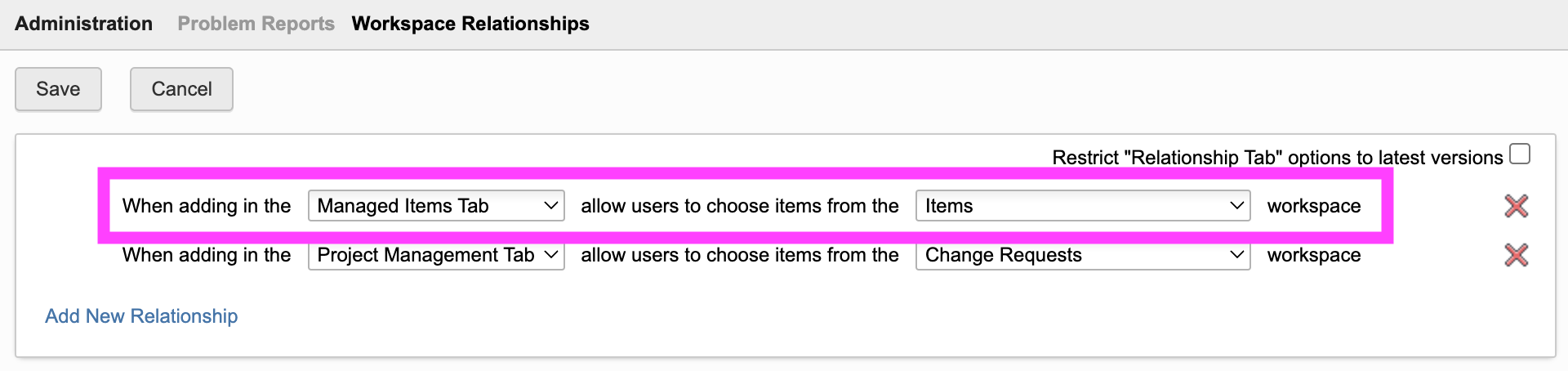
Configure Workspace Relationships of Problem Reports
Open the Workspace Relationships control for workspace Problem Reports in the Workspace Manager. In here, enable connections to workspace Items in Managed Items Tab in order to support creation of new PRs.
Add button to launch the portal
Users can access the service portal by passing the dmsId and wsId of a given record, allowing to encode this information in a qr-code for example (see the end of this page for the given URL).
In addition, you may want to provide a button within the details page of an item to open the given portal from there. For this, add a new field Actions which contains the computed formula shown below. In case your tenant has the given field already, please add this button to the existing Actions field.
Note that this computed field requires the field DMS_ID which must contain the dmsId of the current record. As the other solutions of this package require this field as well, it is assumed that the given field exists already. If not, please add the field as single line text and let it be set upon item creation.
Keep in mind to update the workspace id contained in the formula below if needed. It refers to workspace ID 57 which matches the standard Items workspace. If you are using another id, please adjust the value of parameter wsId.
CASE WHEN (DMS_ID is null) THEN ''ELSE '<a style="color: #0a131c;border: 1px solid #bec8d2;border-radius:3px;text-align:center;text-decoration:none !important;line-height:26px;white-space:nowrap;padding:4px 20px;width:140px;font-weight:600;" target="_blank" href ="LOCATIONservice?wsId=57&dmsId='||DMS_ID||'">Service Portal</a>'END
Add New Workspace Spare Parts Requests
The Service Portal can be used to initiate spare parts requests processes with reference to the currently selected spare parts. Howeever, this feature requires the given workspace to manage these requests. If you do not want to manage these requests in PLM, you may skip this chapter.
If you are using a trial or demo tenant, you can take benefit of the preview version of a Spare Parts Requests solution in the template library. Simply download this given template to your tenant and make sure that you replace the placeholder text fields with the given linking picklists (i.e. field LNKED_ITEM in the details tab and ITEM in the grid tab). Afterwards, you can proceed with the next chapter, too.
In any other case perform the following steps to manually create a new workspaces for management of the spare parts requests.
Add Workspace
Add a new workspace named Spare Parts Requests using the settings shown in the following screenshot:

Item Details Tab
Add the following fields to the new workspace. You may add further fields (non-mandatory) and sections when needed. You may also omit 'Requestor' in all the field labels, they are just used to keep the internal Field ID identical to the label to make the setup easier.
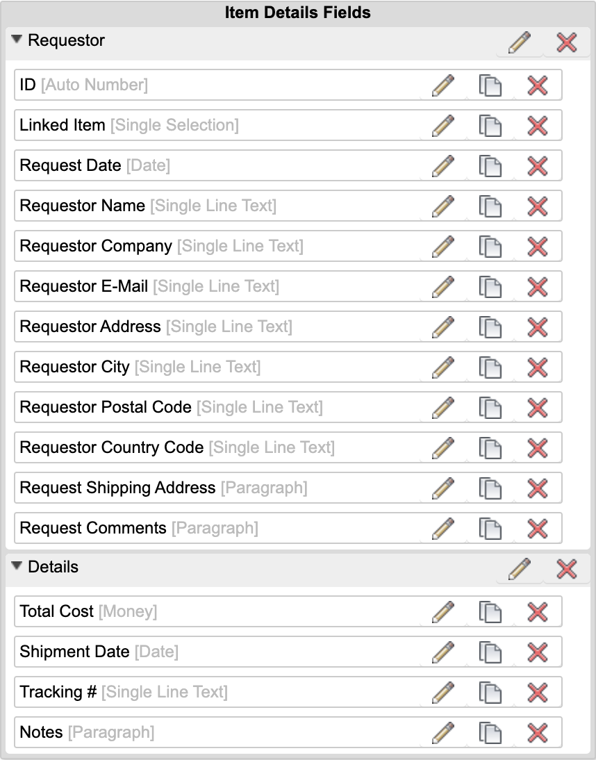
| Label | Field ID | Type | Details | Editable |
|---|---|---|---|---|
| ID | ID | Auto Number | Formula: AUTONUMBER('', ID__AUTO_INC, 6) | false |
| Linked Item | LINKED_ITEM | Pick List ([WS] Items, Single Selection) | length: 200 | Creation Only |
| Request Date | REQUEST_DATE | Date | - | false |
| Requestor Name | REQUESTOR_NAME | Single Line Text | length: 200 | true |
| Requestor Company | REQUESTOR_COMPANY | Single Line Text | length: 200 | true |
| Requestor E-Mail | REQUESTOR_EMAIL | Single Line Text | length: 200 | true |
| Requestor Address | REQUESTOR_ADDRESS | Single Line Text | length: 200 | true |
| Requestor City | REQUESTOR_CITY | Single Line Text | length: 200 | true |
| Requestor Postal Code | REQUESTOR_POSTAL_CODE | Single Line Text | length: 200 | true |
| Requestor Country Code | REQUESTOR_COUNTRY_CODE | Single Line Text | length: 200 | true |
| Request Shipping Address | REQUEST_SHIPPING_ADDRESS | Paragraph | Length: 100000 | true |
| Request Comments | REQUEST_COMMENTS | Paragraph | Length: 100000 | true |
| Total Cost | TOTAL_COST | Money | Length: 10, Field Precision: 0 | true |
| Shipment Date | SHIPMENT_DATE | Date | - | true |
| Tracking # | TRACKING | Single Line Text | Length : 200 | true |
| Notes | NOTES | Paragraph | Length: 100000 | true |
Descriptor
Set the descriptor for this workspace as you like (i.e. ID - Requestor Company)
Grid Tab
Add the following fields to the grid tab

| Label | Field ID | Type | Details | Editable |
|---|---|---|---|---|
| Item | ITEM | Pick List | Pick List [WS] Items (Single Selection) | Creation Only |
| Quantity | QUANTITY | Integer | length: 10 | Creation Only |
| Unit Cost | UNIT_COST | Money | Length: 10, Field Precision: 2 | true |
| Total Cost | TOTAL_COST | Money | Formula: QUANTITY * UNIT_COST; Add aggregation type 'Sum' | false |
| Availability at request | AVAILABILITY_AT_REQUEST | Single Line Text | Length: 50 | true |
| Remarks | REMARKS | Single Line Text | Length: 200 | true |
Tab Names
Adjust the tab names for ease of use:
- Item Details > Request
- Grid > Part List
- Workflow Actions > Workflow
Scripts
Create a new Action script Spare Parts Requests WF Actions with the code shown below. Make sure to select library script getUserName in the script's imports.
item.REQUESTOR_NAME = getUserName();
item.REQUEST_DATE = new Date();
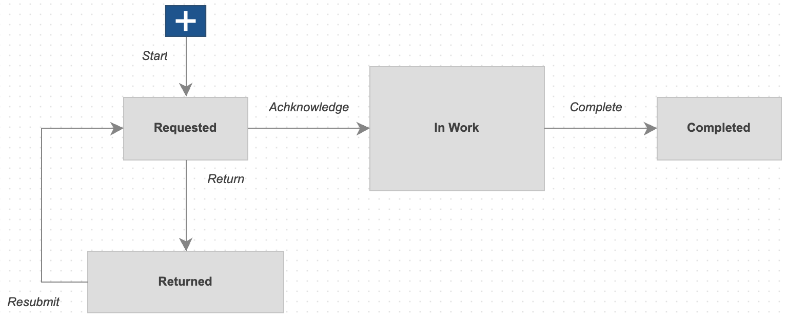
Workflow
Provide a workflow for this new workspace. While the workflow logic does not matter for this solution, make sure to attach the script Spare Parts Requests WF Actions as action script to the initial transition.
Access Permission
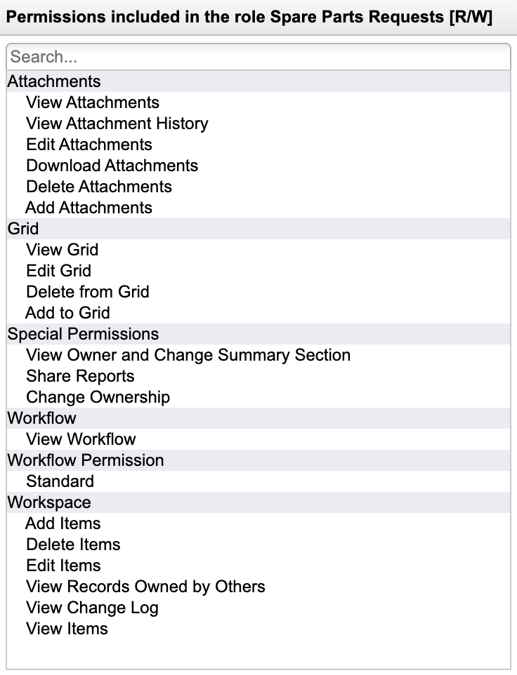
Add a role for this new workspace and assign this given role to your users to enable access. Grant full access (add, delete, edit and view) to the tabs Attachments, Grid, and Workflow.
Landing Page Configuration
You may provide a landing page as part of the Service Portal, enabling users to navigate to the product of interest. If this is configured properly, users do no longer require direct access to a given BOM using the workspace ID and dms ID. Instead, they can click on a given product and with this open the matching service information of the related BOM.
In addition, they can track their formerly created spare parts requests.
With the default configuration, this capability involves the Products workspace. All products matching a defined search critieria will be displayed on the Landing Page. In addition, these products must link to the matching EBOM which will be used to open the given serivce information for the selected product.
Various configuration settings drive this landing page: productsFilter, productsSortBy, productsGroupBy, productsFieldImage, ... wsIdProducts. See their description in the next chapter.
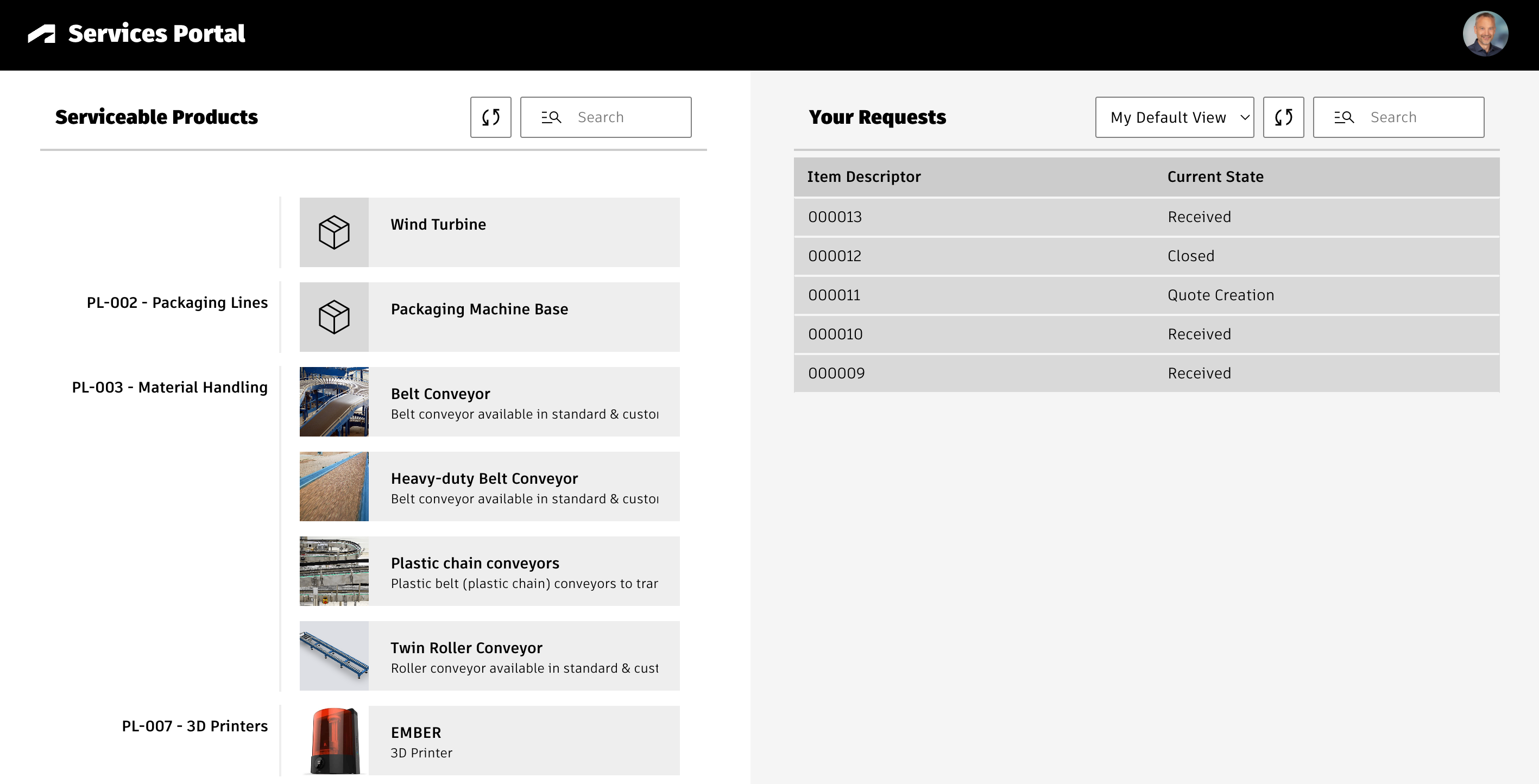
The default configuration of the landing page uses the following settings:
- All products of workspace 95 will be shown (settings wsIdProducts and productsFilter)
- These products will be sorted by Title and grouped by Product Line (settings proudctsSortBy and productsGroupBy)
- Each product tile will show the image of field IMAGE as well as the products' TITLE and DESCRIPTION property values (settings productsFieldIdImage, productsFieldIdTitle, productsFieldIdSubtitle)
- When users click a product, its field ENGINEERING_BOM will be used to open the related EBOM and to open the matching Service Portal for this item (setting productsFieldIdBOM)
- The header of the landing page's list of products is set to 'Serviceable Products' (settings productsListHeader)
You can disable access to this landing page with the home button by setting 'features.homeButton = false'. See chapter Feature Availability for details.
Configuration Settings
Once the previous steps have been completed, you should review the solution's settings in file settings.js before using the application:
export.config = {'service' : {'bomViewName' : 'Service','enableCustomRequests' : true,'endItemFilter' : { 'fieldId' : 'SBOM_END_ITEM', 'value' : true },'fieldId' : 'SPARE_WEAR_PART','fieldValues' : ['spare part', 'yes', 'x', 'y', 'wear part'],'fieldIdSparePartImage' : 'IMAGE','spartPartDetails' : ['MATERIAL', 'ITEM_WEIGHT', 'DIMENSIONS'],'fieldIdPRImage' : 'IMAGE_1','productsFilter' : '','productsSortBy' : 'TITLE','productsGroupBy' : 'PRODUCT_LINE','productsFieldIdImage' : 'IMAGE','productsFieldIdTitle' : 'TITLE','productsFieldIdSubtitle' : 'DESCRIPTION','productsFieldIdBOM' : 'ENGINEERING_BOM','productsListHeader' : 'Serviceable Products','wsIdProducts' : 95,'wsIdProblemReports' : 82,'wsIdSparePartsRequests' : 208,'requestSectionsExcluded': ['Workflow Activity'],'requestColumnsExcluded' : ['UNIT_COST', 'TOTAL_COST', 'MAKE_OR_BUY', 'MANUFACTURER', 'MANUFACTURER_PN', 'LEAD_TIME', 'LONG_LEAD_TIME'],'applicationFeatures' : { 'homeButton' : true, 'toggleItemAttachments' : true, 'toggleItemDetails' : true, 'manageProblemReports' : true, 'showStock' : true, 'requestWorkflowActions': true},'viewerFeatures' : {'cube' : false,'orbit' : false,..} }}
Basic Settings
| Setting | Default Value | Description |
|---|---|---|
| bomViewName | Service | Provide name of the BOM view that has been created in the previous steps (a change should not be required) |
| enableCustomRequests | true | When set to true, users can add non-spare-parts to service requests as well |
| endItemFilter | { 'fieldId' : 'SBOM_END_ITEM', 'value' : true } | BOM items having the given value in the defined field will be considered as end nodes. Users will not be able to see the items below. This filter only applies if the given fieldId is present in your Items workspace. If the field does not exist, this setting will be ignored automatically. Of course you can change this setting to make use of another field. In any case, this field must be included in the BOM view being used by the Service Portal (default is 'Service'). |
| fieldId | SPARE_WEAR_PART | ID of field being used to identify spare parts (the next setting defines the possible values of this field) |
| fieldValues | ['spare part', 'yes', 'x', 'y', 'wear part'] | List of values (for the previous field) which are used to identify spare parts |
| fieldIdSparePartImage | IMAGE | ID of field containing the item image |
| sparePartDetails | ['MATERIAL', 'ITEM_WEIGHT', 'DIMENSIONS'] | Each spare part tile can show 3 additional fields. If other fields than the default fields are relevent, change this list. However, make sure that there are exactly 3 entries and these fields also must be contained in the given BOM view. |
| fieldIdPRImage | IMAGE_1 | Provide image field ID to be use for storing the markup image of new Problem Reports |
| productsFilter | (empty) | Provide a query string to filter the list of products being shown in the landing page. Only products matching this search criteria will be display. For example, you could add a checkbox field 'SERVICES_PORTAL' and provide the following filter to only show products where this given checkbox is enabled: ITEM_DETAILS:SERVICES_PORTAL=TRUE |
| productsSortBy | TITLE | Set the field being used to sort the products in the landing page |
| productsGroupBy | PRODUCT_LINE | This optional setting enables to group the prdoducts in the landing page based on the given field's values |
| productsFieldIdImage | IMAGE | Field being used to render the image for the product tiles in the landing page |
| productsFieldIdTitle | TITLE | Field being used as primary name for the product tiles in the landing page |
| productsFieldIdSubtitle | DESCRIPTION | Field being used as subtitle for the product tiles in the landing page |
| productsFieldIdBOM | ENGINEERING_BOM | Field of Products workspace that links the given EBOM that will be used to retrive product information once a user clicks on a product tile |
| productsListHeader | Serviceable Products | Defines the header being shown on top of the products list in the landing page |
| wsIdProducts | 95 | Provide the workspace ID of Products to let users browse for the product of interest when no dmsId is provided in the URL (95 matches the default tenant configuration) |
| wsIdProblemReports | 82 | Provide the workspace ID of Problem Reports to enable creation of new processes from within the application (82 matches the default tenant configuration) |
| wsIdSparePartsRequests | ? | Provide ID of the new workspace Spare Parts Requests to enable creation of new requests from within the application |
| requestSectionsExcluded | ['Workflow Activity'] | Defines sections to be hidden from Spare Part Request details display. |
| requestColumnsExcluded | ['UNIT_COST', 'TOTAL_COST', 'MAKE_OR_BUY', 'MANUFACTURER', 'MANUFACTURER_PN', 'LEAD_TIME', 'LONG_LEAD_TIME'] | Defines columns to be hidden from Part List when users open a given request within the portal to track its progression. |
Configuring Application Features
Selected application features can be restricted using the applicationFeatures property in settings.js. In general, if a property equals true, the given feature will be available for the user. You can use basic boolean values, but also make use of groups to grant access for defined user groups only. Examples:
- applicationFeatures.homeButton = true > The home button is available for all users
- applicationFeatures.homeButton = false > The home button is not visible for any user
- applicationFeatures.homeButton = ['Employees','Service Technician'] > The home button will only be shown for users in group Employees or Service Technician
The following settings control features within the application:
| Setting | Description | Default Value |
|---|---|---|
| features.homeButton | Enables Home button in global toolbar to close a given product's spare parts view and to return to the landing page | true |
| features.toggleItemAttachments | Enables button 'Toggle Files' in global toolbar to toggle the selected item's attachments on/off | true |
| features.toggleItemDetails | Enables button 'Toggle Details' in global toolbar to toggle the selected item's details on/off | true |
| features.productDocumentation | Enables tab 'Documentation' next to the tab 'Spare Parts', enabling users to download files attached to the context product. Note that this list will be empty if users access the Service Portal with a defined item dmsId. Only if users click on a product in the landing page of the Service Portal, this tab will contain data. | true |
| features.manageProblemReports | Enables tab 'Problem Reports' next to the tab 'Spare Parts', enabling users to reveal related PRs and also to create new ones | true |
| features.showStock | Enables display of stock information in spare parts list | true |
| features.requestWorkflowActions | Enables display of workflow actions menu when opening a spare part request from the landing page | true |
Configuring Viewer Features
This application enables configuration of features within the viewer by using parameter viewerFeatures. By using the settings listed below, you can control the availability of given icons in the viewer toolbar. These feaatures can be enabled and disabled for all users in general by setting the value to true or false. As an alternative, you can also provide an array of groups to grant access. Only users being assigned to any of the defined groups will then get access to the feature. Examples:
- viewerFeatures.measure = true > Measurements will be possible for all users
- viewerFeatures.measure = false > Measurements will not be possible for any user
- viewerFeatures.measure = ['Employees','Service Technician'] > The measurements button will only be shown for users in group Employees or Service Technician
| Setting | Icon | Description |
|---|---|---|
| contextMenu | Enables / disables the viewer standard context menu | |
| cube | Enables the cube / home button in top right corner of the viewer. Parameter 'views' can be used instead, providing dedicated buttons. | |
| orbit | Enables the orbit controls | |
| firstPerson | Enables first person view | |
| camera | Enables camera interactions | |
| measure | Enables the measurements toolbar | |
| section | Enables sectioning | |
| explodedView | Enables exploded views | |
| modelBrowser | Enables browsing the model hierarchy within the viewer | |
| properties | Enables access to the selected component's properties stored in the viewable file | |
| settings | Enables viewer settings | |
| fullscreen | Enables fullscreen toggle | |
| markup | Enables markup toolbar | |
| hide | Enables easy hiding of (selected) components | |
| ghosting | Enables toggling ghosting mode on/off | |
| highlight | Enables toggling highlight of selected models on/off | |
| single | Enables fitting of first instance to viewer | |
| fitToView | Enables reframing all visible items | |
| reset | Enables to deselect all, invoking viewerClickReset() | |
| views | Enables toolbar to quickly access main views | |
| selectFile | Enables switching between multiple viewable files for the given item (3D and 2D) |
Access the Services Portal
You can access the Services Portal portal with the /service endpoint:
To open the portal for a given item directly, provide the wsId dmsId of the Items record as URL parameters. The following links will work for default demo tenants containing the default demo data. Please note that none of the demo items has been set as spare part yet:
Services Portal Change Log
| 10. September 2024 | Enhancement | When components get hidden in the viewer, advanced controls now enable to unhide selected components or the last one |
| 1. July 2024 | Enhancement | This solution is now compatible with the Spare Parts Requests template being available as preview for trial and demo tenants. This required adjustment of some fieldIDs, please review the installation instructions for the new Spare Parts Requests workspace and align with your setup if you used this solution before already. |
| 5. June 2024 | Enhancement | When opening the Service Portal from the landing page by selecting a product, a new Documentation tab provides access to the given product's attachments next to the list of Spare Parts. This tab can be disabled using the setting applicationFeatures.productDocumentation. |
| 2. May 2024 | Enhancement | The configuration of viewer features has been aligned with other apps using the dedicated settings viewerFeatures |
| 26. April 2024 | Enhancement | Added setting features.viewer.hide to support easy hiding of components in viewer |
| Enhancement | When there is no spare part for the current selected BOM item, the portal will now validate if any of the parents is defined as spare part. If so, the first given parent will be shown in the list of available spare parts. | |
| 11. April 2024 | Enhancement | New setting requestSectionsExcluded enables hiding defined sections from the Spare Part Request Details. The details display is still driven by the user permissions and sections can be hidden based on their access permissions defined in the Workspace Manager. |
| Enhancement | New setting requestColumnsExcluded enables hiding defined columns from the Parts List of a Spare Part Request shown in the portal. | |
| Quallity | Change some CSS setting to improve display of given requests witin the portal | |
| 8. April 2024 | Enhancement | Behavior for item selection in viewer has been changed. When users click in item, remaining geometry will no longer be ghosted to allow for follow-up seleciton. The selected item still gets highlighted in BOM and matching spare part list as well as Item Details and Item Attachments get refreshed to match the selection. |
| Enhancement | Added new controls in viewer to reframe visible items and to fit only first visible instance in viewer. Both can be disabled by new options in settings.js. | |
| 20. March 2024 | Enhancement | Selected spare parts will be moved to a new cart panel now and not only be highlighted in blue. From this cart, users can filter the viewer for cart items and also trigger the spare part request creation. |
| Enhancement | Option endItemFilter has been added to settings file to prevent expansion of defined BOM nodes. | |
| Enhancement | The request creation dialog has been enhanced to capture more information, including contact details These contact details will be filled auotmatically based on the user's Autodesk Account data. | |
| Enhancement | New feature toggle has been added to prevent display of stock information for spare parts : features.showStock | |
| Enhancement | New feature toggle has been added to prevent workflow actions for spare parts requests : features.requestWorkflowActions | |
| Enhancement | A new function has been added to set the stock information for all spare parts. Override this function setSparePartStockStatus in file /javascripts/custom/service.js to implement your custom logic. | |
| 19. March 2024 | Enhancement | Feature control: Restrict access to application features for all users or specific user groups using the settings file |
| Enhancement | Routing has been enabled : Browser URL gets updated when users switch between landing page and item context to enable refresh of the current screen | |
| 14. March 2024 | Enhancement | When users open an existing spare parts request in the landing page, this request will no longer be shown in PLM, but the portal instead. Users can still perform workflow actions and upload additional files in this view. |
| Bugfix | When users closed the dialog for creation of a new spare parts request and reopened the dialog afterwards, the quantities were reset for each line. Now, these quantities are preserved. | |
| Bugfix | Users can no longer submit an empty request | |
| Enhancement | A new icon is used for the button to submit the spare parts request | |
| 29. February 2024 | Enhancement | The BOM display will be collapsed at startup automatically |
| Enhancement | Spare parts in the BOM tree will no longer be highlighted by bold / orange font, but with a dedicated icon and matching tooltip | |
| Enhancement | If BOM items are not accessible due to access permission restrictions, this will be indicated by red lock icons in the BOM tree | |
| 9. February 2024 | Enhancement | A new toolbar on top of the Spare Parts list enables searches, filtering and deselection |
| Enhancement | Viewer behavior upon BOM item selection and Spare Part Zoom has been adjusted for better usability | |
| Enhancement | A new button in the viewer toolbar enables toggling ghosting on and off | |
| Enhancement | Additional options now can be configured in settings.js (i.e. enabling a filter for the products in the landing) | |
| Quality | Global toolbar icon sequence has been adjusted | |
| 26. January 2024 | Enhancement | The following buttons got removed from the viewer toolbar: Model Structure, Properties and Settings |
| Enhancement | The BOM tree now highlights spare parts with orange text | |
| 10. January 2024 | New Feature | The portal can be opened without context item to let users browse for the product of interest |
| New Feature | Users now can track previously created spare part requests from within the portal | |
| New Feature | Users can submit requests for items which are not flagged as spart part. This feature can be disabled with new option 'enableCustomRequests' in settings file. | |
| 26. September 2023 | Enhancement | Display root item name in web page title |
| 3. August 2023 | Bugfix | Improved behavior of markup toolbar at lower resolutions |
| Bugfix | Width of markups and font size of markup text can now be set properly | |
| 7. July 2023 | Enhancement | When spare parts get zoomed in, they will be highlighted in red within the viewer |
| New Feature | Users can click items in the viewer to get it selected in the spare parts list and to retrieve item details as well as attachments | |
| Enhancement | The Options button in main toolbar has been replaced by dedicated toggles | |
| Enhancement | All spare parts selected in the panel to the right will now be highlighted in blue within the viewer to continuously indicate the selection | |
| Enhancement | The (fake) stock information now is also shown with a colored border in the spare parts list | |
| Enhancement | When users click on BOM entries, geometry not being in context will be hidden (before, it was still shown transparently) | |
| 30. June 2023 | New Feature | The spare parts list now indicates the total quantity of the given component (qty is shown in white with black background) |
| New Feature | The entries in the spare parts list will automatically adjust its style in case of longer lists (tile height get reduced) |
Features
With this application, users can by far better assess the impact of changes by reviewing all details of the given Change Order's list of Affected Items.
To do so, multiple information is retrieved in parallel and devided in various tables. So for each affected item, users can easily review the following information:
- 3D view of the attached dwf
- Change Log tab reveals the item's change log
- The Item tab shows details defined in the affected items tab itself
- All Item Details can be reviewed in the Details tab
- The flat BOM can be listed in the BOM tab, where items that got changed will be highlighted by color.
- Users can select items in the BOM tab and have the given component highlighted in the 3D view
- The Where Used tab will be used to retrieve all End Items of an item (the root item nodes not having any further parents). In this view, users can also add the given nodes to the CO's list of Affected Items.
- In tab Impacted, users can see all records linked to the affected item within its Relationships tab. This tab also will show all BOM root nodes which are neither managed in the 'Items and BOMs' nor in the 'Vault Items and BOMs' workspace. The latter one will for example show if a component is used within a product's BOM.
- Inside the Impacted tab, users can easily link given records of interest to the current Change Order's References tab for later reuse
- In tab Changed Items, users can get the list of all BOM sub items where the working version got modified and which are not listed in the list of Affected Items yet
- The item's Attachments can be opened in the Files tab
- All item related change processes are listed in tab Processes
Configuration Changes
Peform the following changes to workspace Change Orders to enable the impact analysis before releasing a change. In addition, you can perform the same changes in workspace Change Requests to benefit of the exact same features while accessing impact of a proposed change.
Store DMSID
In order to make this dashboard work, you have to add a (hidden) field DMS_ID to the item details tab. This field must store the dmsID of the current process.
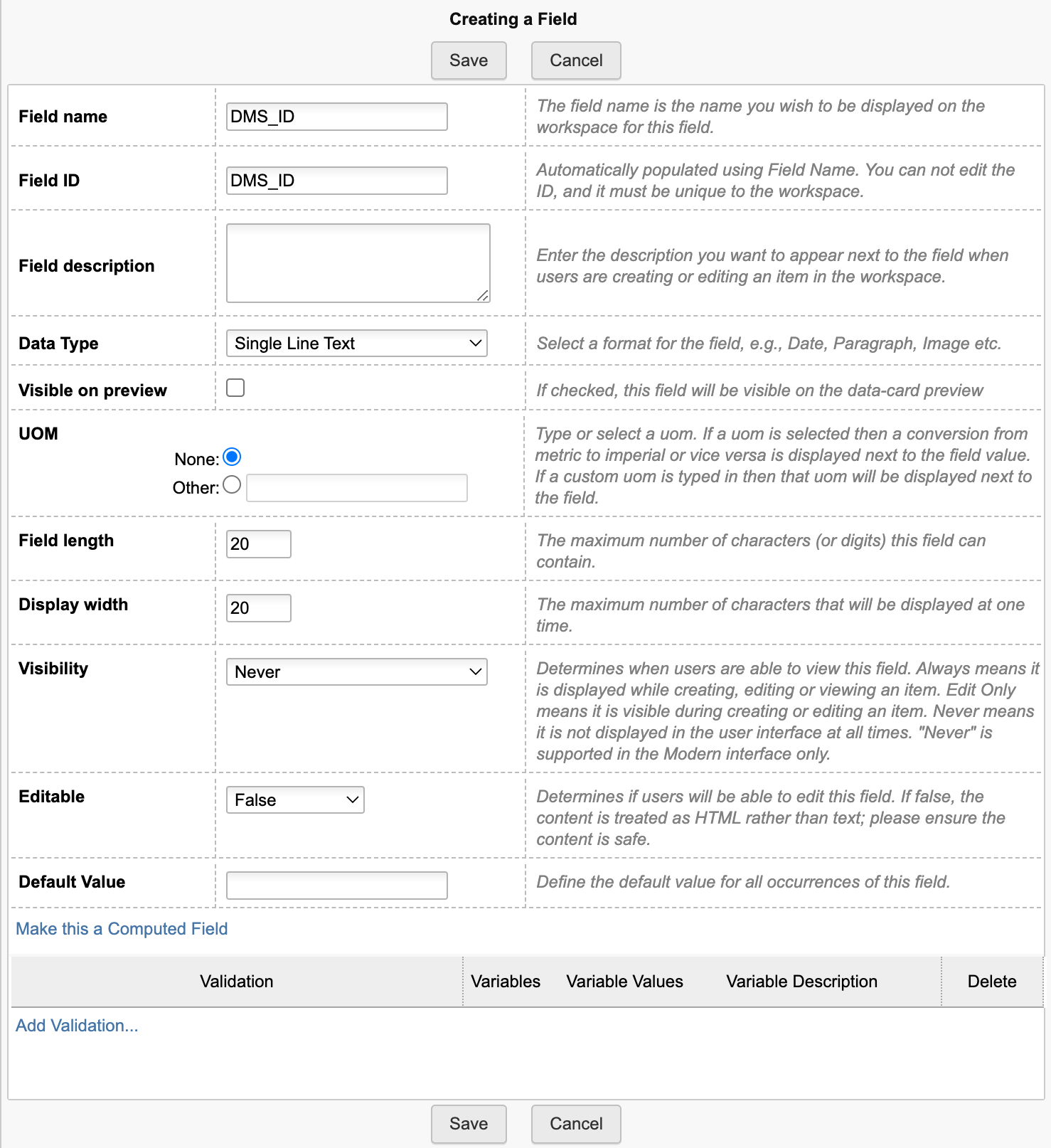
Use the following script code at Change Orders / Change Requests creation to store the given dmsID (attach this script to the initial workflow transition or the given create event):
item.DMS_ID = dmsID;
Action Button
Add a button to the Item Details tab, enabling to open the analysis dashboard in context ...
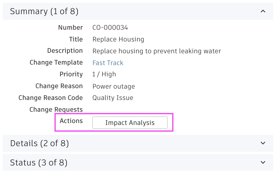
... implement this button by adding a computed field Actions with the formula shown below. Replace the workspace ID to match yours (..wsId=84..). In a standard tenant, 84 matches the Change Orders and 83 matches the Change Requests workspace.
'<a style="border: 1px solid #bec8d2;border-radius:3px;color: #0a131c;font-weight:600;line-height:32px;padding:4px 20px;text-align:center;text-decoration:none !important;white-space:nowrap;width:160px;" target="_blank" href ="LOCATIONimpactanalysis?wsId=84&dmsId='||DMS_ID||'">Impact Analysis</a>'
Set Workspace Relationships (optional)
The impact analysis dashboard enables to connect records of interest to the current change process. For example, the dashboard will retrieve related Requirements of each affected item - which then can be connected to the change process inside the dashboard for reference. This helps to create a comprehensive list of all data being impacted by a change. This mechanism requires to allow the given workspace relationships within the Workspace Manager. For example, you may want to enable Relationships for the change proceses to the workspaces Requirements and Supplier Packages. The dashboard will take this workspace configuration into account and only offer to connect workspaces that are valid.
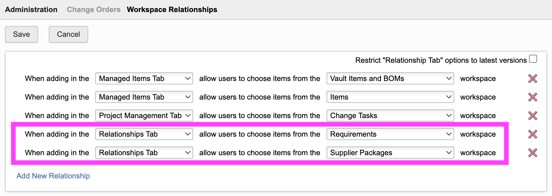
Access the Dashboard
The dashboard also can be opened by using the /impactanalysis endpoint, followed by wsId and dmsId. If your tenant contains the standard demo dataset, you can use the following link to open the dashboard for a given Change Order:
Change Impact Analysis Change Log
| 20. June 2024 | Enhancement | Improved the root items report listing all root items (and intermediate items) being impacted |
| 27. September 2023 | Enhancement | Indicate pending supplies, production orders and available stock for Affected Items (requires given columns) |
| 14. September 2023 | Enhancement | If CR or CO is locked, changes to affected items are no longer possible |
| 30. August 2023 | New Feature | If the Affected Items tab contains columns to manage current stock, pending production orders and pending deliverables, this information will be shown and highlighted. |
| 15. August 2023 | Enhancement | When opened from a Change Request, the list of Affected Items will display the Proposed Change property value |
| 7. July 2023 | Enhancement | Styling has been adjusted to improve usability |
Features
- Add EBOM items to the MBOM easily with clicks
- Add further items to the MBOM using drag & drop
- Use the Disassemble mode to quickly define the MBOM by reversing the order
- Use color codes to identify mismatches in EBOM and MBOM
- Access details of selected items in right hand side panel whenever needed
- Manage multiple MBOMs per EBOM item (i.e. site specific BOMs)
Important - Read before proceeding
This editor helps in transitioning an Engineering BOM to a Manufacturing BOM. This may involve one or two item workspaces, depending on your tenant configuration and preference. If your tenant has been created before Mid 2023, your tenant will most likelly have two workspaces to manage items: Items and BOMs as well as Vault Items and BOMs. If your tenant is more recent, it will only contain the new workspace named Items (unless you installed the Vault Items and BOMs from the template library).
If your tenant only has the single Items workspace, this workspace will be used to manage both the EBOMs and the MBOMs. In this case, all installation steps referring to both EBOM and MBOM must be applied to this workspace. You can skip all steps referring to the 2 Workspaces setup.
On the other hand, if you have two workspaces, you can use the one for the EBOM and the other one for the MBOM. In this case, you will most likely use Vault Items and BOMs as the EBOM workspace and Items and BOMs as the MBOM workspace. This setup is referred to as the 2 Workspaces setup in the instructions below. Of course, you can also choose one of these workpaces and use it for both EBOM and MBOM at the same time.
Note that the viewer inside the MBOM Editor will only work if the base EBOM item has a dwf file attached.
Configuration Changes for EBOM Workspace
Extend Item Details
Add a new section Manufacturing BOM with the following fields to this workspace:
| Field Name | Field ID | Data Type | Options | Visibility | Editable |
|---|---|---|---|---|---|
| DMS_ID | DMS_ID | Single Line Text | Length : 20 | Never | False |
| End Item | END_ITEM | Check Box | Always | True | |
| Matches MBOM | MATCHES_MBOM | Check Box | Always | True | |
| Ignore in MBOM | IGNORE_IN_MBOM | Check Box | Always | True | |
| Process Code | PROCESS_CODE | Single Line Text | Length : 10 | Always | True |
| Last MBOM User | LAST_MBOM_USER | Single Line Text | Length : 100 | Always | True |
| Last MBOM Sync | LAST_MBOM_SYNC | Date | Always | True | |
| MBOM | MBOM | Pick List | To MBOM workspace ([WS] Items), Single Selection | Always | True |
Finally, add a computed field 'MBOM_EDITOR' with the following formula. Make sure to provide the right workspace ID (...?wsId=57...). It has to match the EBOM workspace ID (57 matches the standard Items workspace).
CASE WHEN (DMS_ID is null) THEN 'Item ID is not set'WHEN (END_ITEM = true) THEN 'Not available for end items'WHEN (MATCHES_MBOM = true) THEN 'EBOM matches MBOM'ELSE '<a style="color: #0a131c;border: 1px solid #bec8d2;border-radius:3px;text-align:center;text-decoration:none !important;line-height:32px;white-space:nowrap;padding:4px 20px;width:140px;font-weight:600;" target="_blank" href ="LOCATIONmbom?wsId=57&dmsId='||DMS_ID||'">Edit MBOM</a>'END
While the layout does not matter, it is recommended to combine the given fields in a Matrix within this section as shown below.
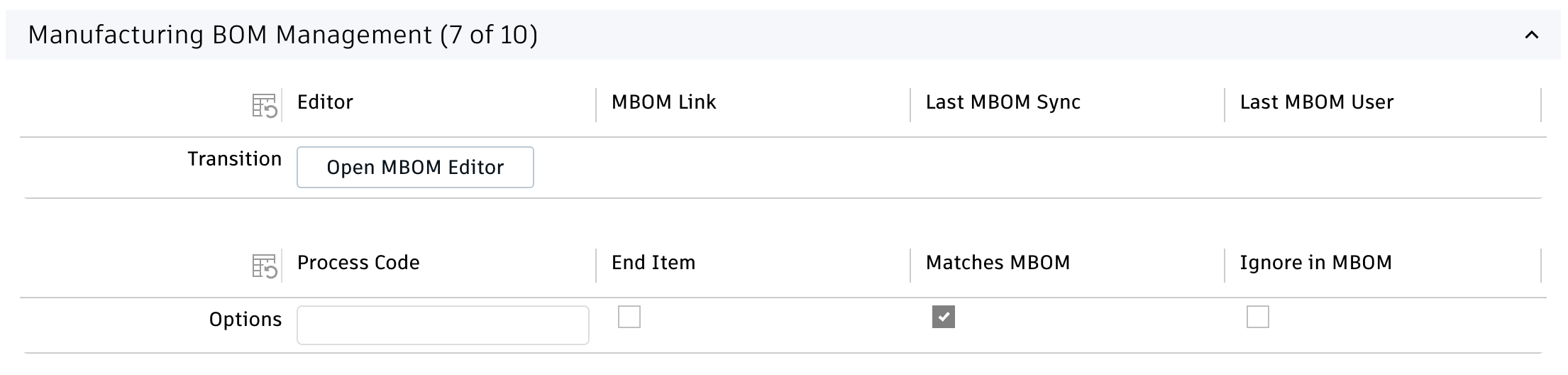
New BOM View
Add a new BOM view MBOM Transition to the EBOM workspace. Add all the fields that were created in the step before to this view - plus a few others. You may also add any further column as you like. The sequence of columns does not matter.
- Descriptor
- PDM Category
- Quantity
- Number
- MBOM
- Last MBOM Sync
- Process Code
- End Item
- Matches MBOM
- Ignore in MBOM
- Revision
Configuration Changes for MBOM Workspace
The following steps must be performed in the workspace to manage the MBOMs - which could be the same one as for the previous steps or a second one in case of a 2 workspaces setup.
Adjust Item Details
Make sure that the NUMBER field of your MBOM workspace is editable (always or at item creation).
Extend Item Details
If you use the same workspace for both the EBOM and MBOM, simply add the following fields to this EBOM & MBOM workspace. You may add these fields to the matrix created before:
- Add field EBOM as linking pick list to the EBOM workspace (EBOM, Single Selection, editable)
- Add checkbox 'Is Process' (IS_PROCESS, hidden, editable)
If instead you will use two different workspaces (i.e. manage the EBOM in Vault Items and BOMs and the MBOM in Items and BOMs workspace), you also have to add the following fields to the MBOM workspace in addition:
- If it does not exist yet, add Single Line Text field 'DMS_ID' (DMS_ID, length 20, not editable, hidden)
- Add date field 'Last MBOM Sync' (LAST_MBOM_SYNC, visible, editable)
- Add Single Line Text field 'Process Code' (PROCESS_CODE, length 10, visible, editable)
- Add computed field 'MBOM_EDITOR' with the following formula. Make sure to provide the right workspace ID (...?wsId=57...). It has to match the MBOM workspace ID (57 matches the standard Items workspace).
CASE WHEN (DMS_ID is null) THEN 'Item ID is not set'WHEN (END_ITEM = true) THEN 'Not available for end items'ELSE '<a style="color: #0a131c;border: 1px solid #bec8d2;border-radius:3px;text-align:center;text-decoration:none !important;line-height:32px;white-space:nowrap;padding:4px 20px;width:140px;font-weight:600;" target="_blank" href ="LOCATIONmbom?wsId=57&dmsId='||DMS_ID||'">Edit MBOM</a>'END
These fields once again can be managed in a dedicated section and matrix when using two distinct workspaces:
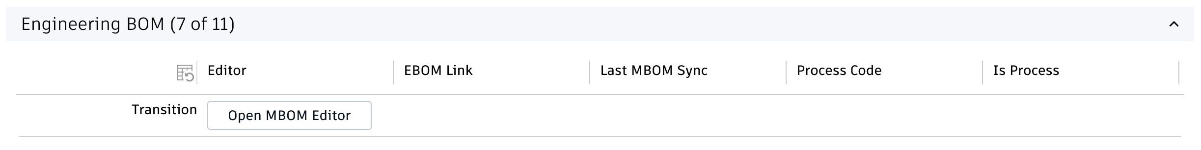
Add new fields to Bill of Materials tab
Add two new fields to the Bill of Materials tab in your MBOM workspace. These fields will be required for the next step and added to the given BOM view.
- Add Checkbox field 'Is EBOM Item' (IS_EBOM_ITEM, hidden, editable)
- Add Single Line Text field 'EBOM Root Item' (EBOM_ROOT_ITEM, length 50, hidden, editable)
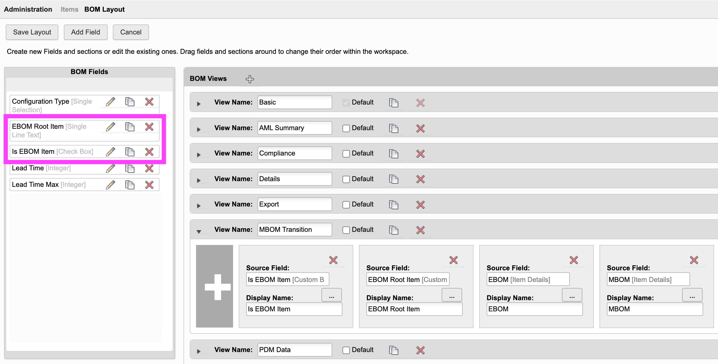
BOM View
If you use the same workspace for both the EBOM and MBOM, add the following fields to the existing BOM view MBOM Transition:
- EBOM
- Is Process
- Is EBOM Item
- EBOM Root Item
If instead you will use two different workspaces, you have to add a new BOM view MBOM Transition with at least the following columnns:
- EBOM
- Is Process
- Process Code
- Descriptor
- Revision
- Quantity
- Is EBOM Item
- EBOM Root Item
Additional step for 2 workspaces setup
Make sure that the MBOM workspace allows for BOM connections to the EBOM workspace:
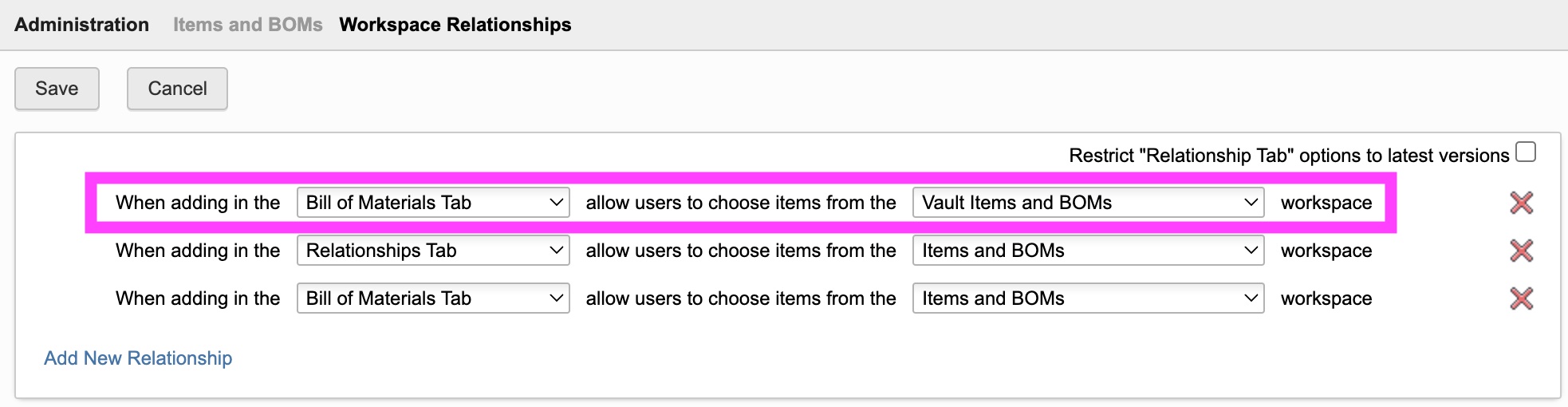
Scripts
For both the EBOM and MBOM workspace, the system has to store the dmsID for new records in field DMS_ID. Add the following script code to the creation event of both workspaces. If your tenant is based on the template released in April 2023, this field exists in your tenant and will be set by script already.
item.DMS_ID = dmsID;
Default Values for new items
When users add operations and MBOM items, these new items may receive default values for defined fields, like a specific type. Such defaults can be defined in the file settings.js - see next chapter for details. The default settings file provides a placeholder example:
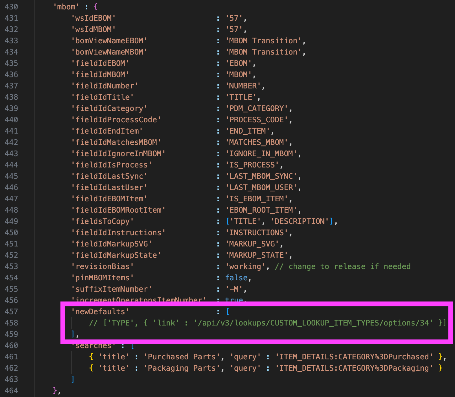
You can provide an array of all the fields to be populated with default values. As shown in the example above, this requires the field's ID (TYPE) and value. In addition, the setting fieldsToCopy enables definition of a list of fields which will be copied from the given related EBOM item to the new MBOM item.
Server Settings File
Review the following contents in file settings.js. The default configuration matches the standard tenant template and makes use of the Items workspace only. If you change this file, a restart of your server is required.
export.config = {'mbom' : {'wsIdEBOM' : '57','wsIdMBOM' : '57','bomViewNameEBOM' : 'MBOM Transition''bomViewNameMBOM' : 'MBOM Transition''fieldIdEBOM' : 'EBOM'...}}
Field Mapping
This area within settings.js contains a couple of parameters to adjust the field IDs being used whenever needed. You may want to review this list, but if you followed the setup instructions, this mapping should be fine already.
| fieldIdEBOM | Field of MBOM workspace to refer to given EBOM item |
| fieldIdMBOM | Field of EBOM workspace to refer to given MBOM item |
| fieldIdNumber | Number field of both EBOM and MBOM Workspace |
| fieldIdTitle | Title field of MBOM Workspace that will be used when creating new processes |
| fieldIdCategory | Category field of EBOM Workspace (being used to highlight certain categories) |
| fieldIdProcessCode | Process Code field of both EBOM and MBOM Workspace |
| fieldIdEndItem | End Item field of EBOM Workspace |
| fieldIdMatchesMBOM | Matches MBOM field of EBOM Workspace |
| fieldIdIgnoreInMBOM | Ignore in MBOM field of EBOM Workspace |
| fieldIdIsProcess | Is Process field of MBOM Workspace |
| fieldIdLastSync | Last MBOM Sync field of EBOM and MBOM Workspace |
| fieldIdLastUser | Last MBOM User field of EBOM Workspace |
| fieldIdEBOMItem | Field 'Is EBOM Item' in MBOM Workspace BOM |
| fieldIdEBOMRootItem | Field 'EBOM Root Item' in MBOM Workspace BOM |
Application Options
Following settings are much more important. They impact the mechanism of the MBOM Editor. Please review these settings carefully.
| Setting | Default Value | Description |
|---|---|---|
| wsIdEBOM | 57 | Workspace ID of your EBOM Workspace |
| wsIDMBOM | 57 | Workspaces ID of your MBOM Workspace (can be the same as EBOM or a different one) |
| bomViewNameEBOM | MBOM Transition | BOM View being used to expand the EBOM |
| bomViewNameMBOM | MBOM Transition | BOM View being used to expand the MBOM |
| fieldsToCopy | ['TITLE', 'DESCRIPTION'] | Defines a list of fields to be copied from EBOM to MBOM when the editor creates the MBOM root node. This is happening when the editor is launched for the first time for a given EBOM item. These fields must be available in both the EBOM and MBOM workspace with the same id. |
| revisionBias | working | Defines the BOM expansion bias, ensuring to use working versions of all items automatically. Change this to release if you want to work with released data instead. Note that if set to working, the MBOM Editor will automatically navigate to the latest working version of an EBOM item, even if it gets opened from a released item. |
| pinMBOMItems | false | Determines if relationship in MBOM should be pinned to the given revision |
| suffixItemNumber | -M | When the editor is opened for an EBOM item that does not have matching MBOM item yet, this given MBOM root item will be created automatically. If this parameter is set, this MBOM root item will be created with the same part number as the matching EBOM item plus the given suffix. With this standard value, EBOM item 00812 will be connected to MBOM item 00812-M for example. |
| newDefaults | ['ITEM_TYPE' , { 'link' : '/api/v3/lookups/CUSTOM_LOOKUP_ITEM_TYPES/options/34' }] | Provide default values for new items being created by the MBOM Editor (i.e. the Processes). Provide an array of pairs containing fieldId and given value. The default value sets the item to 'Process' (works with latest tenant template only). |
| searches | [{ 'title' : 'Purchased Parts', 'query' : 'ITEM_DETAILS:CATEGORY%3DPurchased' }, { 'title' : 'Packaging Parts', 'query' : 'ITEM_DETAILS:CATEGORY%3DPackaging' }] | The Add Items tab may provide preconfigured queries for quick access to relevant MBOM items, right underneath the generic Search view. This list of predefined views can be adjusted here. Provide a list of views, defined by a title to be displayed in the editor and the given query string to execute. If you are not sure about the query string, please have a look at the standard search dialog and review the Network tab in your browser to grab the matching search filters. |
This application enables configuration of features within the viewer by using parameter viewerFeatures. By using the settings listed below, you can control the availability of given icons in the viewer toolbar. These feaatures can be enabled and disabled for all users in general by setting the value to true or false. As an alternative, you can also provide an array of groups to grant access. Only users being assigned to any of the defined groups will then get access to the feature. Examples:
- viewerFeatures.measure = true > Measurements will be possible for all users
- viewerFeatures.measure = false > Measurements will not be possible for any user
- viewerFeatures.measure = ['Employees','Service Technician'] > The measurements button will only be shown for users in group Employees or Service Technician
| Setting | Icon | Description |
|---|---|---|
| contextMenu | Enables / disables the viewer standard context menu | |
| cube | Enables the cube / home button in top right corner of the viewer. Parameter 'views' can be used instead, providing dedicated buttons. | |
| orbit | Enables the orbit controls | |
| firstPerson | Enables first person view | |
| camera | Enables camera interactions | |
| measure | Enables the measurements toolbar | |
| section | Enables sectioning | |
| explodedView | Enables exploded views | |
| modelBrowser | Enables browsing the model hierarchy within the viewer | |
| properties | Enables access to the selected component's properties stored in the viewable file | |
| settings | Enables viewer settings | |
| fullscreen | Enables fullscreen toggle | |
| markup | Enables markup toolbar | |
| hide | Enables easy hiding of (selected) components | |
| ghosting | Enables toggling ghosting mode on/off | |
| highlight | Enables toggling highlight of selected models on/off | |
| single | Enables fitting of first instance to viewer | |
| fitToView | Enables reframing all visible items | |
| reset | Enables to deselect all, invoking viewerClickReset() | |
| views | Enables toolbar to quickly access main views | |
| selectFile | Enables switching between multiple viewable files for the given item (3D and 2D) |
Viewer Part Number Mapping
The MBOM Editor will load the selected EBOM item's viewable in the viewer and allow for interactions between the BOMs and the viewer. However, this requires a mappging of your item numbers and the property within the dwf which holds the item number as well.
For a proper match, see the 'viewer' parameters at the end of settings.js. Provide the field ID of your Number field in EBOM workspace as 'fieldIdPartNumber'. Additionally, provide a list of possible property names in 'partNumberProperties' that might be present in your dwf files and contain the matching number too - the first occurence will be taken into account.
export.config = {'viewer' : {'fieldIdPartNumber' : 'NUMBER''partNumberProperties' : ['Part Number', 'Name', 'label', 'Artikelnummer', 'Bauteilnummer'],'backgroundColor' : 255,'groundReflection' : false,'groundShadow' : true...}}
Support for multiple sites
With the standard configuration steps above, there will be only one MBOM per EBOM. However, the setup can be changed to support multiple MBOMs, for example to have site specific MBOMs. To achieve this setup, the fields that were created formerly must be cloned for each site.
By following the steps below, the existing fields will be kept in order to have a 'standard' base MBOM. In addition, further fields will be added to capture the MBOM for 'Site 1' and 'Site 2'.
Each site requires a unique id that you can define yourself. This id must be used to name the new fields and it will be passed to the MBOM editor to define the site context. In this setup, 'G' will be used for the generic MBOM while '1' and '2' are used for the site specific MBOMs. Keep in mind that these suffixes will get appended to all site specific MBOM item numbers.
- In the EBOM workspace, adjust the layout of the MBOM transition section as shown below, by adding a second matrixes to hold all the site specific contents:
- Create new fields for the 2nd matrix. You have to create the same fields multiple times, one for each site. Always append the site index (G, 1, 2) to each field while keeping the field base name identical. Here are the fields for the Generic MBOM:
- MBOM_G: Linking picklist to MBOM item workspace (single selection, editable)
- LAST_MBOM_SYNC_G: Date field (editable)
- LAST_MBOM_USER_G: Single Line Text (length 100, editable)
- MBOM_EDITOR_G: Computed field with the following formula. Note that the URL contains a parameter to identify the site (G)
CASE WHEN (DMS_ID is null) THEN 'Item ID is not set'WHEN (END_ITEM = true) THEN 'Not available for end items'WHEN (MATCHES_MBOM = true) THEN 'EBOM matches MBOM'ELSE '<a style="color: #0a131c;border: 1px solid #bec8d2;border-radius:3px;text-align:center;text-decoration:none !important;line-height:32px;white-space:nowrap;padding:4px 20px;width:140px;font-weight:600;" target="_blank" href ="LOCATIONmbom?wsId=57&dmsId='||DMS_ID||'&options=site:G">Edit MBOM</a>'END
Repeat these steps for site 1 and 2 accordingly.
- If you followed the setup instructions for a single MBOM before, remove the following fields as they are no longer required:
- MBOM
- Last MBOM Sync
- Last MBOM User
- MBOM Editor
- In the end, the MBOM section should look like this:
Note that you can choose other field labels of course. This documentation only reuses the field ID to better describe the setup process.
- In the EBOM workspace's BOM view MBOM Transition add the following columns:
- MBOM_G
- MBOM_1
- MBOM_2
Note that your bom view might be named differently. Check for the name in use by validating setting mbom.bomViewNameEBOM in settings.js
Users are now able to open the editor for a specific site. Each site will receive a specific MBOM with a dedicated part number (the site suffix gets appended at the end):
MBOM Editor Change Log
| September 27, 2024 | Bugfix | The setting newDefaults only got applied to new processes, not the MBOM root item. This has been fixed. |
| September 26, 2024 | Bugfix | If pick list fields were defined in fieldsToCopy, the MBOM editor failed to load. Now the given field values get copied properly. |
| September 11, 2024 | New Feature | Add new button to EBOM actions enabling to set given assembly as end item |
| New Feature | A new button in EBOM Alignment can be used to hide the viewer | |
| New Feature | In tab EBOM Alignment, users can now hide components in the viewer | |
| 11. June 2023 | Enhancement | Enabled configuration of viewer features using the settings file and parameterviewerFeatures |
| 13. Dezember 2023 | Bugfix | When clicking button Add All, only visible items were taken into account. Subcomponents of assemblies that were collapsed were not added to the MBOM. |
| 21. September 2023 | New Feature | When items in MBOM get selected, the adjacent items get highlighted in the viewer as well (red and green) |
| 3. August 2023 | Bugfix | Switch to latest version automatically (i.e. if editor is opened from Rev A, the editor will locate matching working version first and then open data for this working version item) |
| 21. July 2023 | New Feature | Insert EBOM as is to MBOM (supported by checkbox Matches MBOM) |
| New Feature | Insert EBOM as MBOM node (this creates the matching MBOM for the given EBOM in the editor and inserts the node) | |
| 7. July 2023 | New Feature | Support of multiple Manufacturing BOMs per item |
| Enhancements | Better alignment with new default client: ready-to-use settings and replacement of 'operations' with 'processes' reflected by a dedicated item type | |
| Bugfix | Items that are added from outside the EBOM will no longer be taken into account in item matching / coloring | |
| Bugfix | When items get added to a location twice, its quantity will be increased accordingly; there will be no second node in the BOM any |
Features
- Manage variant items that inherit master data from the base item
- 3D viewer helps to identify the right items
- Keep multiple BOM structures in sync
- Manage multiple variants at the same time or focus a single variant only
- Dynamically define the properties that define a variant
New Workspace Item Variants
A new workspace is required to manage items and BOMs that are specific for a given variant. These item variants will refer to the given base item to allow for data reuse by using derived fields, but will also have additional fields that define a variant (i.e. color, material, dimeions, serial #, ...). Customers can choose any properties they like for these variant specific properties, the application will adjust accordingly.
Create new workspace
Use the Workspace Manager to create new workspace Item Variants as revision controlled workspace. 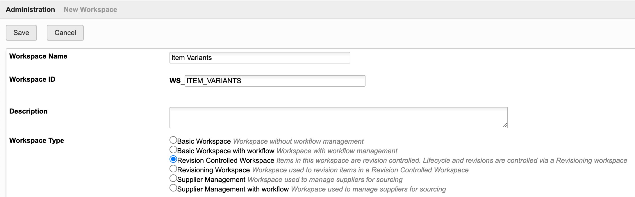
Set Item Details of new workspace
Create 3 sections in Item Details tab:
- Basic
- Variant Definition
- Base Item
Add the following fields to section Basic:
- Number (id: NUMBER, Single Line Text, length : 20, Visibility : Always, Editable: false)
- Index (id: VARIANT_INDEX, Single Line Text, length : 5, Visibility : Always, Editable: false)
- Title (id: TITLE, Single Line Text, length: 200, Editable: true)
- Base Item (id: BASE_ITEM, Picklist to [WS] Items, single selection, Editable: false)
- DMS_ID_BASE_ITEM (id: DMS_ID_BASE_ITEM, Single Line Text, length : 20, Visibility : Never, Editable: true)
In section Variant Definition, add all the fields that will be used to define a variant, for example Colour and Material. This section may include any type of field, including pick lists (with single selection).
All data that should be derived from the Base Item must be defined in section Base Item Data. Make use of derived fields to copy data from the given base item. This may for example include Type, Description, Image and further fields of your items workspace.
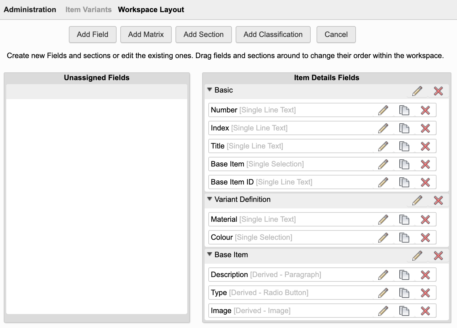
Descriptor
Set the workspace's Descriptor to display the fields Number, Index and Title:
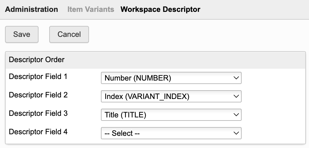
Workspace Relationships
Enable required relationships in the BOM tab:
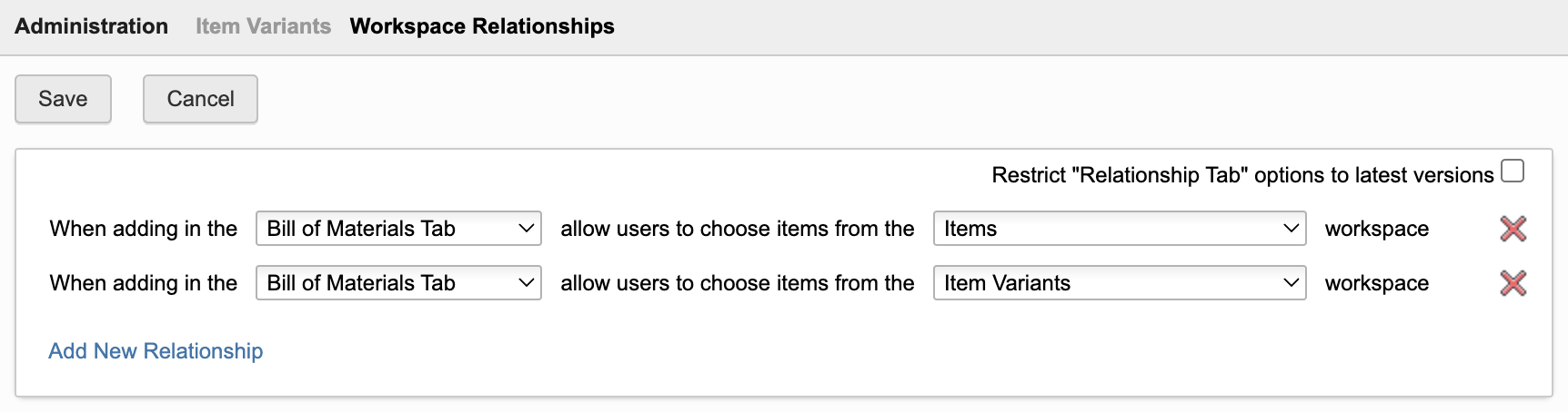
As Item Variants are revision controlled, add this new workspace to the Managed Items tab of the following workspaces:
- Problem Reports
- Change Requests
- Change Orders
Tab Names
Adjust the names of some tabs as shown below.
| Tab | New Label |
|---|---|
| Item Details | Item Variant |
| Workflow Actions | Related Change Processes |
Access Permissions
Create a role for the new workspace enabling creation of new records, BOM management and attachments.
Make sure that users also can access the working versions of records.
Bill of Materials tab
Add the following BOM field in workspace Item Variants:
| Field ID | Field Type | Field Settings | Editable |
|---|---|---|---|
| EDGE_ID_BASE_ITEM | Single Line Text | Length : 20, Visibility: Never | true |
Add the following columns to the Default View (sequence does not matter):
| Field ID | Field Source |
|---|---|
| EDGE_ID_BASE_ITEM | BOM Fields |
| DMS_ID_BASE_ITEM | Item Details Fields |
In addition, add all fields of section Variant Definition to this table (for example Colour and Material).
Scripts
In order to link the variant items with the given base items, a script is required. Create a new action script Item Variants onCreate onEdit and attach this script to the create and edit event of workspace Item Variants:
linkBaseItem();
function linkBaseItem() {if(item.BASE_ITEM !== null) return;if(item.DMS_ID_BASE_ITEM === null) return;var elemBase = loadItem(item.DMS_ID_BASE_ITEM);var listVariants = elemBase.VARIANTS;if(listVariants === null) {listVariants = []; elemBase.VARIANTS = item; } else elemBase.VARIANTS.add(item);item.NUMBER = elemBase.NUMBER;item.VARIANT_INDEX = ('00' + listVariants.length).toString().slice(-2);item.BASE_ITEM = elemBase;}
Action Button
Enable access to the Variants Manager app by adding a new computed field to your Items workspace. Use the following formula for the new field:
'<a style="border: 1px solid #bec8d2;border-radius:3px;color: #0a131c;font-weight:600;line-height:32px;padding:4px 20px;text-align:center;text-decoration:none !important;white-space:nowrap;" target="_blank" href ="LOCATIONvariants?wsId=57&dmsId='||DMS_ID||'">Variant Manager</a>'
Adjust Items Workspace
Add field Variants
In the Item Details tab of workspace Items, add a linking picklist field Variants allowing multiple selection. This field should link to the new Item Variants workspace created before. Set this field visible and editable.
Add field to store dmsID
The items workspace (from where the app will be launched) also must have a field containing the item's dmsID. If not present yet, add a new single line text field with id DMS_ID in the items workspace (hidden). Let this field be set automatically at item creation by script as shown below.
Tenants created mid 2023 or later have this field and script already.
item.DMS_ID = dmsID;
Configure BOM View
The application requires a BOM view with the following columns:
| Field | Field Source |
|---|---|
| Descriptor | System Fields |
| Quantity | BOM Fields |
| Number | Item Details Fields |
You may add a new view Variant Management with these columns or reuse an existing BOM view containing these columns (the view may also contain further columns of course). If you prefer to use a BOM view that is not named Variant Management, you have to speficfy this view's name in the server's settings file in parameter.
config.variants.bomViewNameVariants : 'Variant Management'
See next chapter Server Settings File for details.
Optional: Enable Product Variants
To better integrate the new workspace for the item variants with the Products workspace, you may adjust the grid tab of workspace Products. The BOM column now can be changed to allow for selection of the given variant BOM:
Server Settings File
If you require usage of different field names, table names etc, please have a look at the settings.js file and locate section variants, listing all possible configurable settings as shown below. Review the first option wsIdItemVariants which must contain the workspace ID of your newly created workspace. You can retrieve this ID from your browser's URL when navigating to this workspace using the workspaces menu.
export.config = {'variants' : {'wsIdItemVariants' : 208'variantsSectionLabel' : 'Variant Definition','fieldIdVariantBaseItem' : 'DMS_ID_BASE_ITEM','fieldIdItemVariants' : 'VARIANTS','bomViewNameItems' : 'Variant Management','bomViewNameVariants' : 'Default View'}}
Adjust these settings if needed and restart your server afterwards to apply the given changes.
| Setting | Default Value | Description |
|---|---|---|
| wsIdItemVariants | - | Workspace ID of your new Item Variants workspace |
| variantsSectionLabel | Variant Definition | Name of section in the Item Variants workspace which contians all the fields that define a variant. This section will drive the columns of the manager dialog. |
| fieldIdItemVariants | VARIANTS | Field ID of your Items workspaces which contians the linking picklist to item variants, to allow for retrieval of existing variants. |
| bomViewNameItems | Variant Management | BOM view of items workspace which contains the required fields |
| bomViewNameVariants | Default View | BOM view of item variants workspace which contains the required fields |
Configuring Viewer Features
This application enables configuration of features within the viewer by using parameter viewerFeatures. By using the settings listed below, you can control the availability of given icons in the viewer toolbar. These feaatures can be enabled and disabled for all users in general by setting the value to true or false. As an alternative, you can also provide an array of groups to grant access. Only users being assigned to any of the defined groups will then get access to the feature. Examples:
- viewerFeatures.measure = true > Measurements will be possible for all users
- viewerFeatures.measure = false > Measurements will not be possible for any user
- viewerFeatures.measure = ['Employees','Service Technician'] > The measurements button will only be shown for users in group Employees or Service Technician
| Setting | Icon | Description |
|---|---|---|
| contextMenu | Enables / disables the viewer standard context menu | |
| cube | Enables the cube / home button in top right corner of the viewer. Parameter 'views' can be used instead, providing dedicated buttons. | |
| orbit | Enables the orbit controls | |
| firstPerson | Enables first person view | |
| camera | Enables camera interactions | |
| measure | Enables the measurements toolbar | |
| section | Enables sectioning | |
| explodedView | Enables exploded views | |
| modelBrowser | Enables browsing the model hierarchy within the viewer | |
| properties | Enables access to the selected component's properties stored in the viewable file | |
| settings | Enables viewer settings | |
| fullscreen | Enables fullscreen toggle | |
| markup | Enables markup toolbar | |
| hide | Enables easy hiding of (selected) components | |
| ghosting | Enables toggling ghosting mode on/off | |
| highlight | Enables toggling highlight of selected models on/off | |
| single | Enables fitting of first instance to viewer | |
| fitToView | Enables reframing all visible items | |
| reset | Enables to deselect all, invoking viewerClickReset() | |
| views | Enables toolbar to quickly access main views | |
| selectFile | Enables switching between multiple viewable files for the given item (3D and 2D) |
Variant Manager Change Log
| 28. June 2024 | Viewer Features Configuration | Additional settings were added to settings.js enabling to select the features available in the viewer |
| 7. July 2023 | Initial Release | This is the very first version of this application |
Prerequisites
You can use this solution with any workspace that has the Classification section enabled. The installation instructions below describe how to enable this extension for workspace Items, but you can also enable it for any other workspace (including Items and BOMs and Vault Items and BOMs).
Required Changes
Item Details Tab
Use the Workspace Manager to add the fields described below to your context workspace. It is recommended to add all these fields to the same (new) section Classification Summary and position them in a matrix, but both is not required. These fields will be set by script, so their placement does not matter. Tenants created mid 2023 or later will have all these fields already, only the last one Class Browser should be missing.
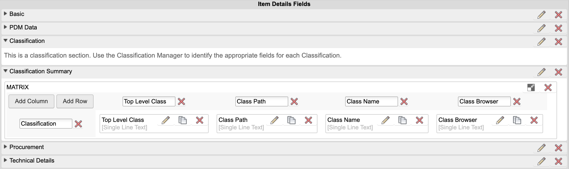
| Label | Field ID | Type | Details | Editable |
|---|---|---|---|---|
| DMS_ID | DMS_ID | Single Line Text | Field Length: 20; set visibility to Never | False |
| Top Level Class | TOP_LEVEL_CLASS | Single Line Text | Field Length : 200 | False |
| Class Path | CLASS_PATH | Single Line Text | Field Length : 1000 | False |
| Class Name | CLASS_NAME | Single Line Text | Field Length : 200 | False |
| Class Browser | CLASS_BROWSER | Single Line Text | Insert the computed field formula shown below | False |
CASE WHEN (CLASS_NAME is null) THEN '' ELSE '<a style="border: 1px solid #bec8d2;border-radius:3px;padding:4px 20px;color: #0a131c;font-weight:600;line-height:26px;text-align:center;text-decoration:none !important;white-space:nowrap;width:160px;" target="_blank" href="http://localhost:8080classes?wsId=57&dmsId='||DMS_ID||'">Find Similar Parts</a>' END
Note that this formula must contain the right workspace ID (..wsId=57..) to match the ID of workspace Items in your tenant (57 is valid for the default tenant).
Of course, the classification section also must be present in this workspace :-)
Scripts
The fields that were created just before must be updated by scripts every time a new record gets created or when it gets modified. Make sure that the following code is invoked at item creation and during item edit events.
In the standard tenants of mid 2023 and later, this should already be included in script Items onCreate onEdit.
if(item.DMS_ID !== dmsID) item.DMS_ID = dmsID;
setClassSummary();
function setClassSummary() {var rootClass = "";var classPath = "";var className = "";if(Object.keys(item.classification).length > 0) {var path = item.classificationSection.getClassificationPath();if(path.length > 0) { rootClass = path[0];className = path[path.length - 1];classPath = rootClass;if(path.length > 1) {for(var i = 1; i < path.length; i++) {classPath += ' / ' + path[i];}}}}if(item.TOP_LEVEL_CLASS !== rootClass) item.TOP_LEVEL_CLASS = rootClass;if(item.CLASS_PATH !== classPath) item.CLASS_PATH = classPath;if(item.CLASS_NAME !== className) item.CLASS_NAME = className;}
Access the Class Browser
From now on, once an item gets classified, there will be a button Find Similar Parts in section Classification Summary to open the Class Browser in a new tab:
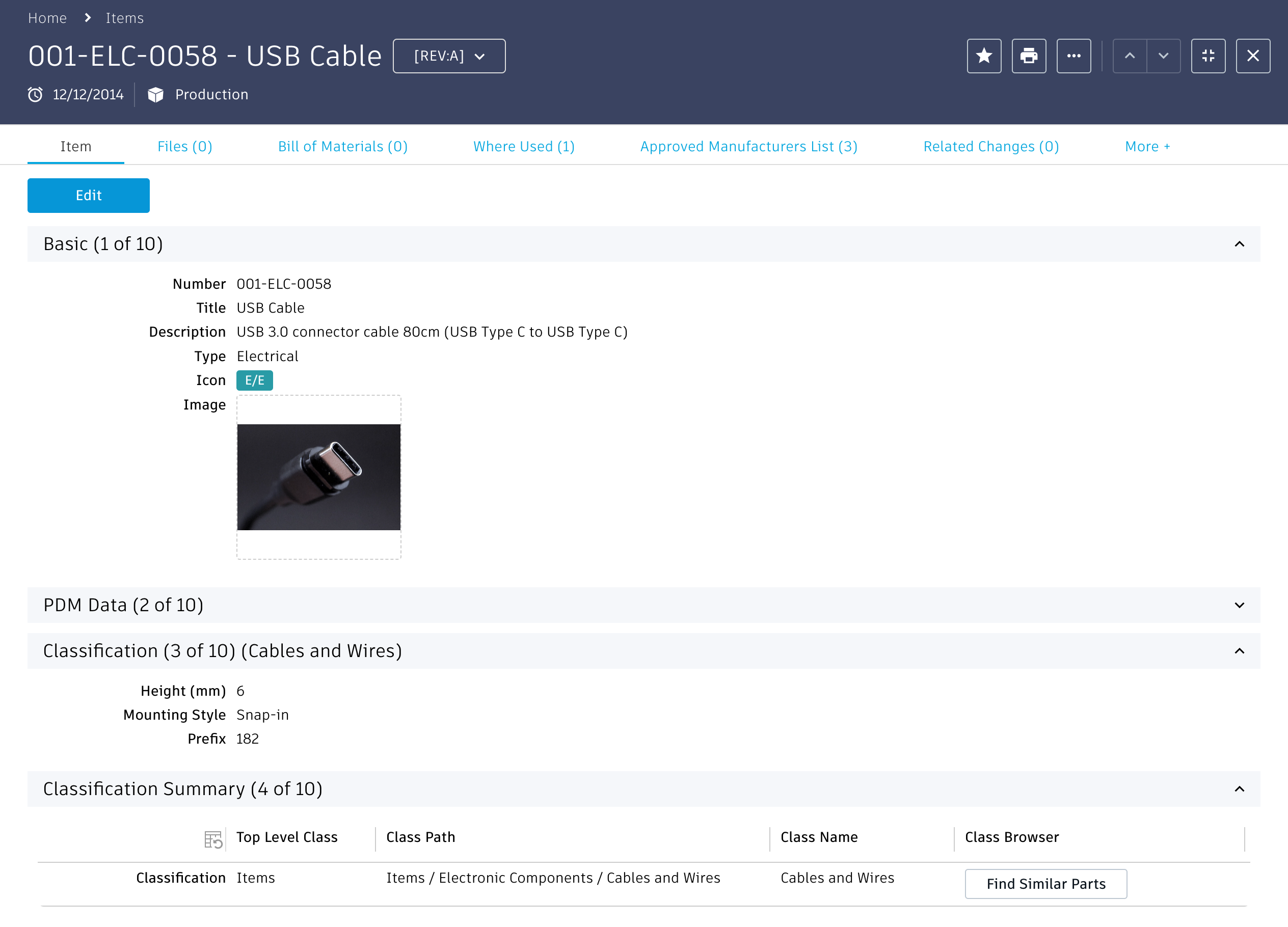
Class Browser Change Log
| 7. July 2023 | Enhancement | New default tenant now contains required fields of this extension to reduce implementation efforts and provide value for all users |